
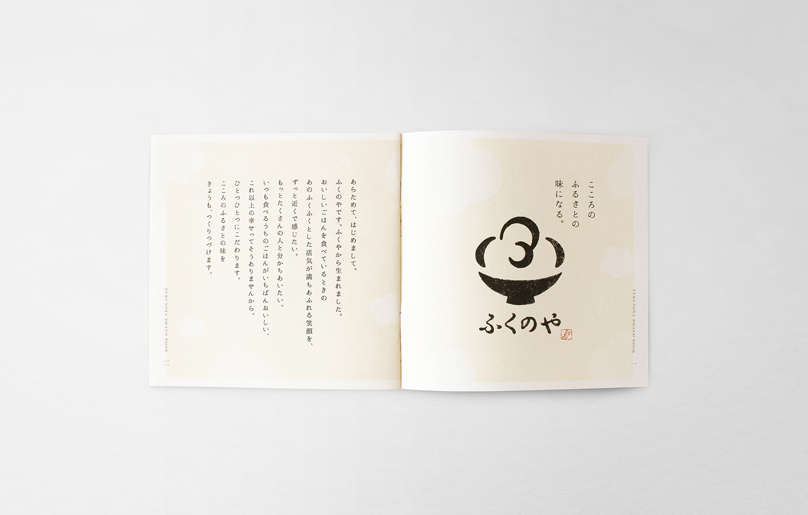
The taste of hometown in your heart.
こころのふるさとの味になる。
FUKUYA manufactured and sold Karashi Mentaiko for the first time, was a small grocery store that originally opened at Nakasu market.
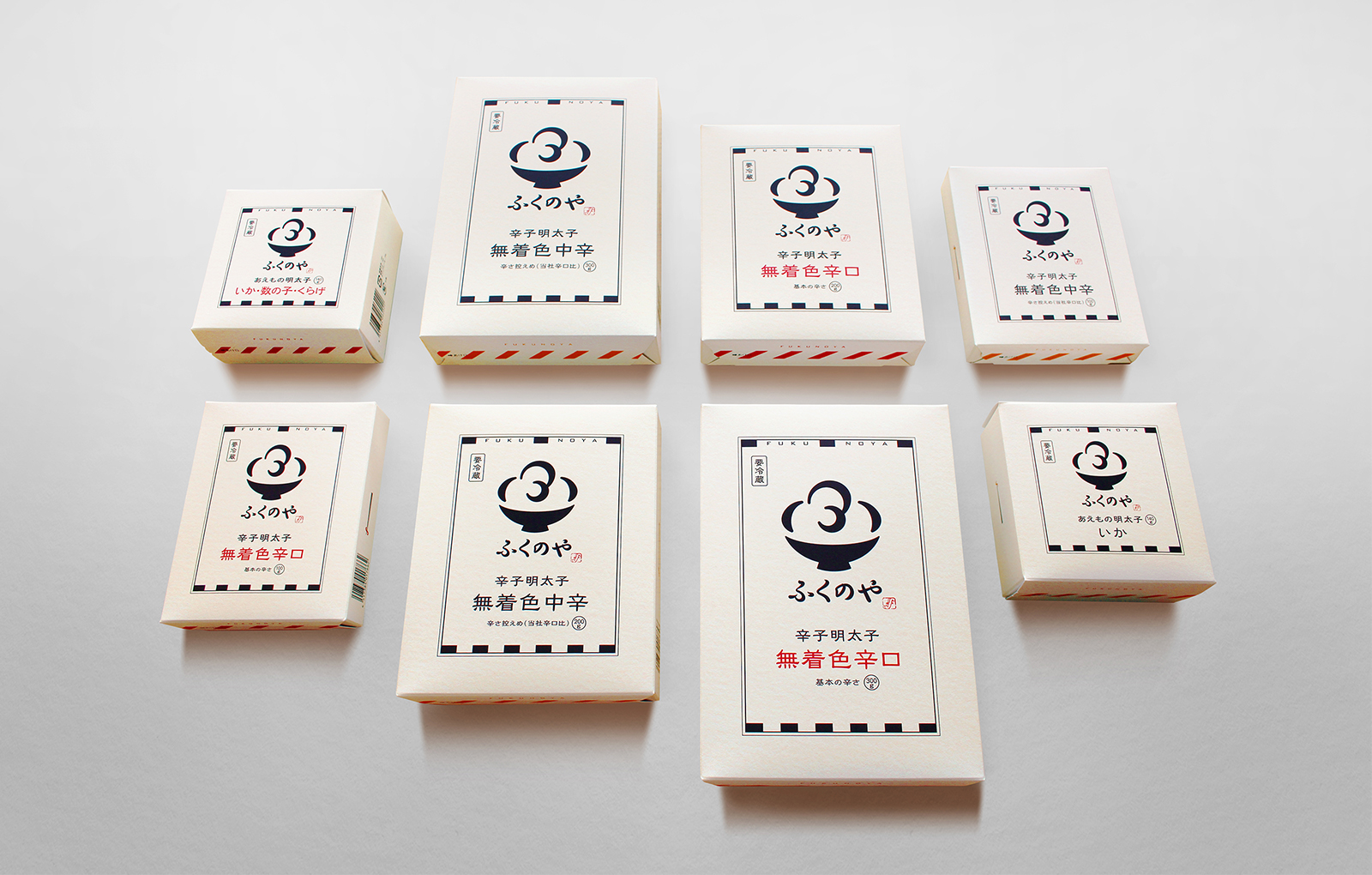
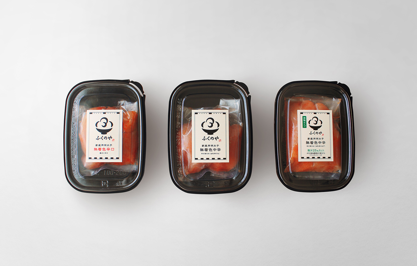
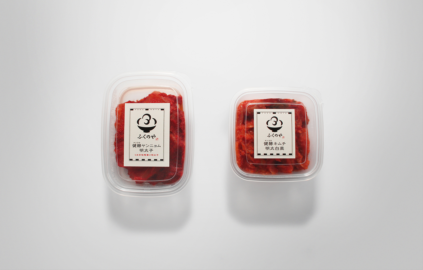
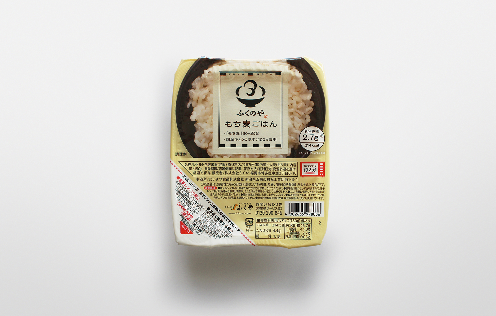
“FUKUNOYA” is a food brand that is easy for customers to buy them.
初めて明太子を製造販売したふくやは、もともと中州市場で開いた小さな食料品店でした。
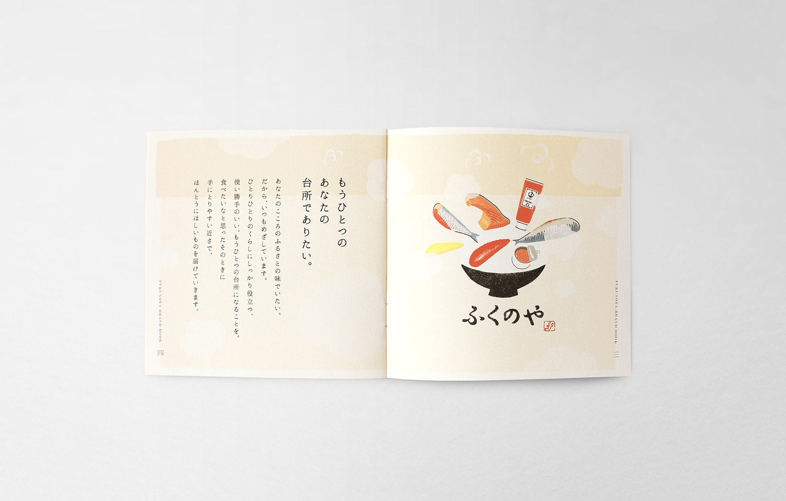
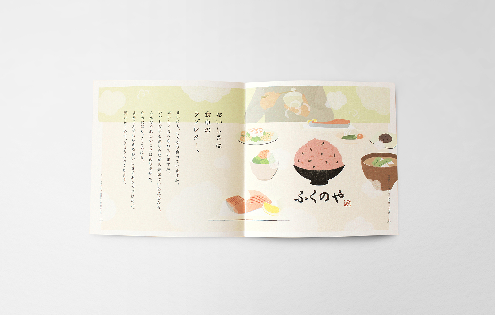
その原点である“食料品”をお客様にとってもっと身近に届けるブランドが「ふくのや」です。
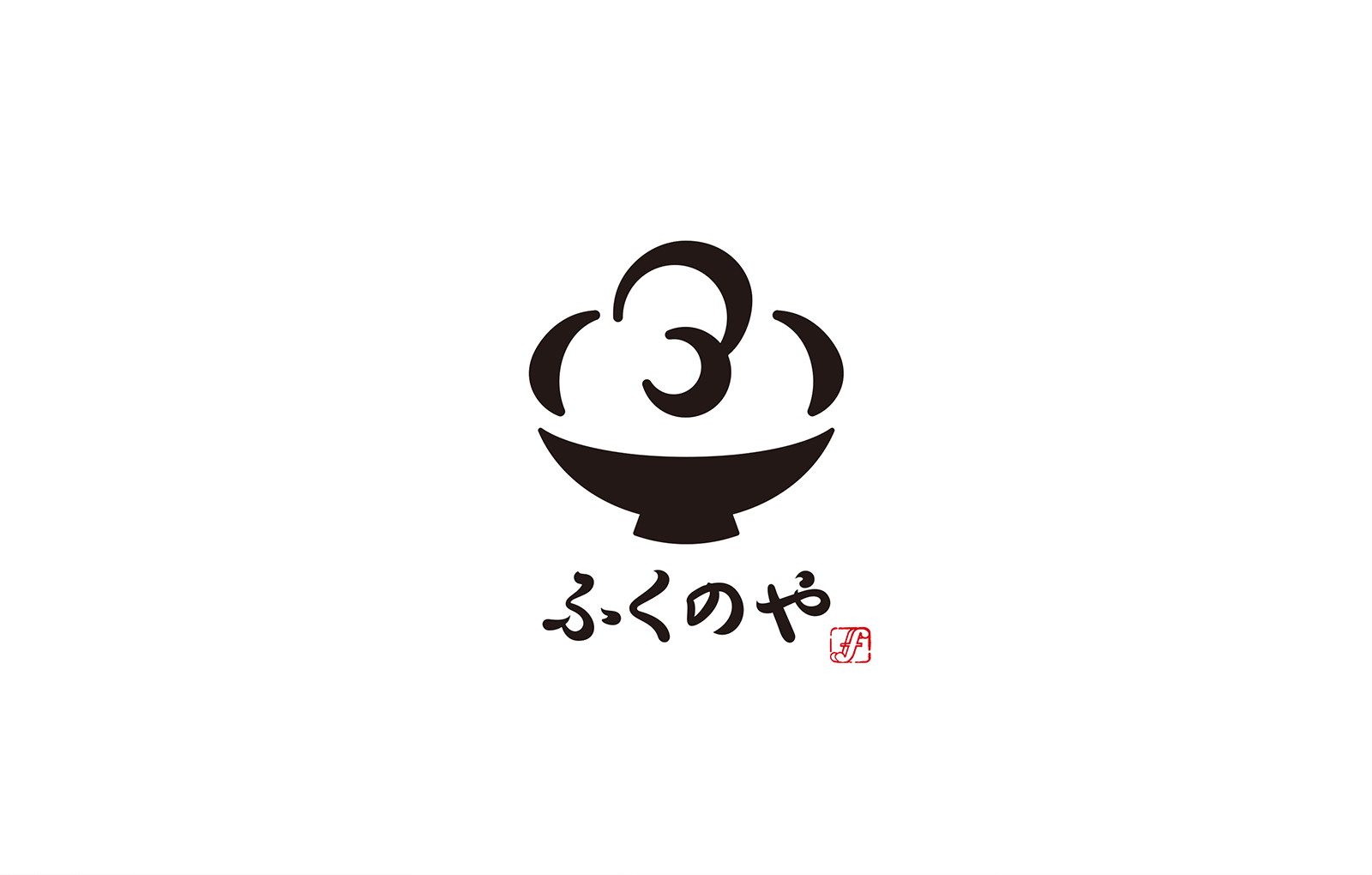
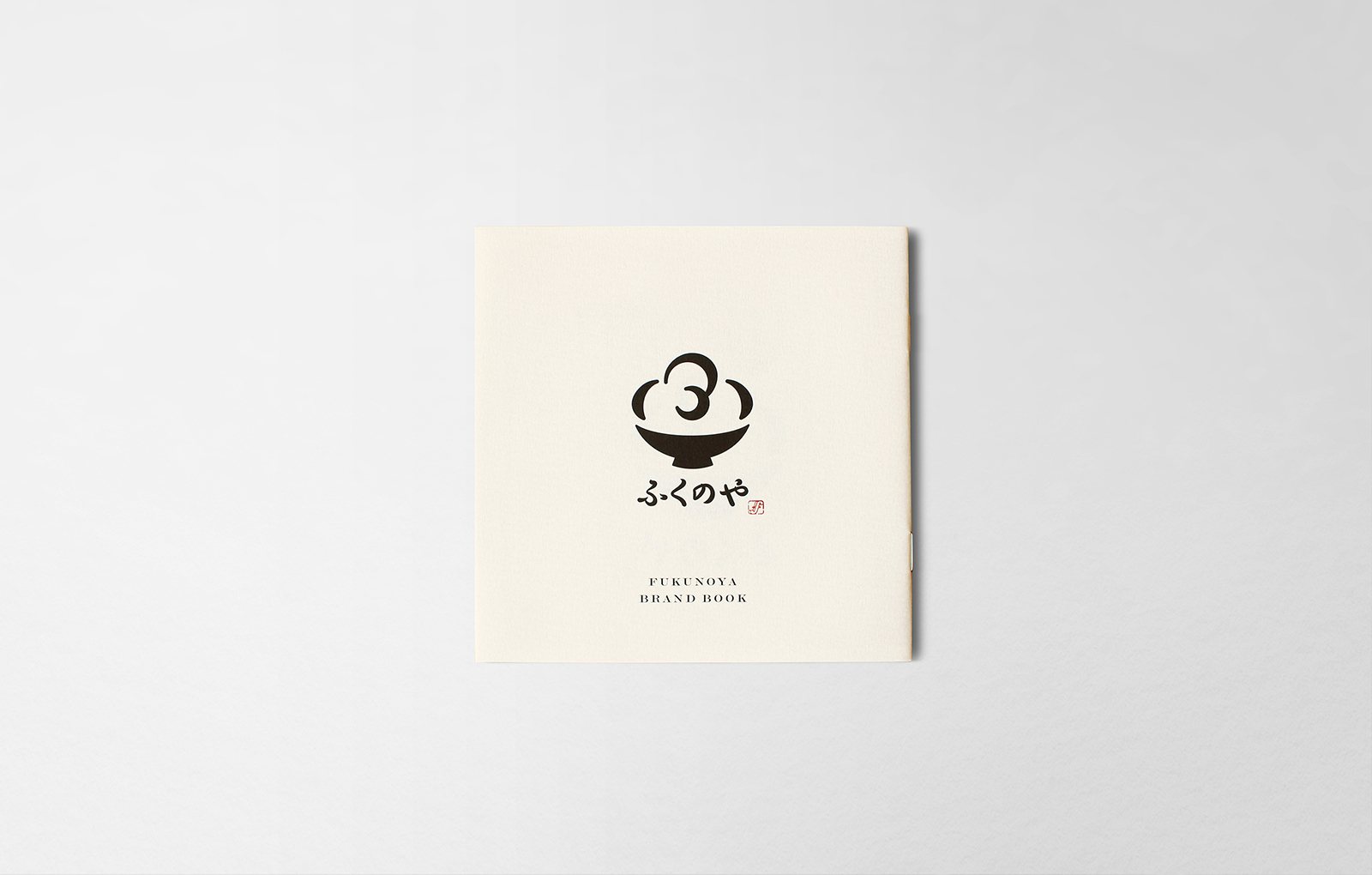
Building the icon that symbolizes Japanese food.
日本食を象徴とするアイコンを作る。
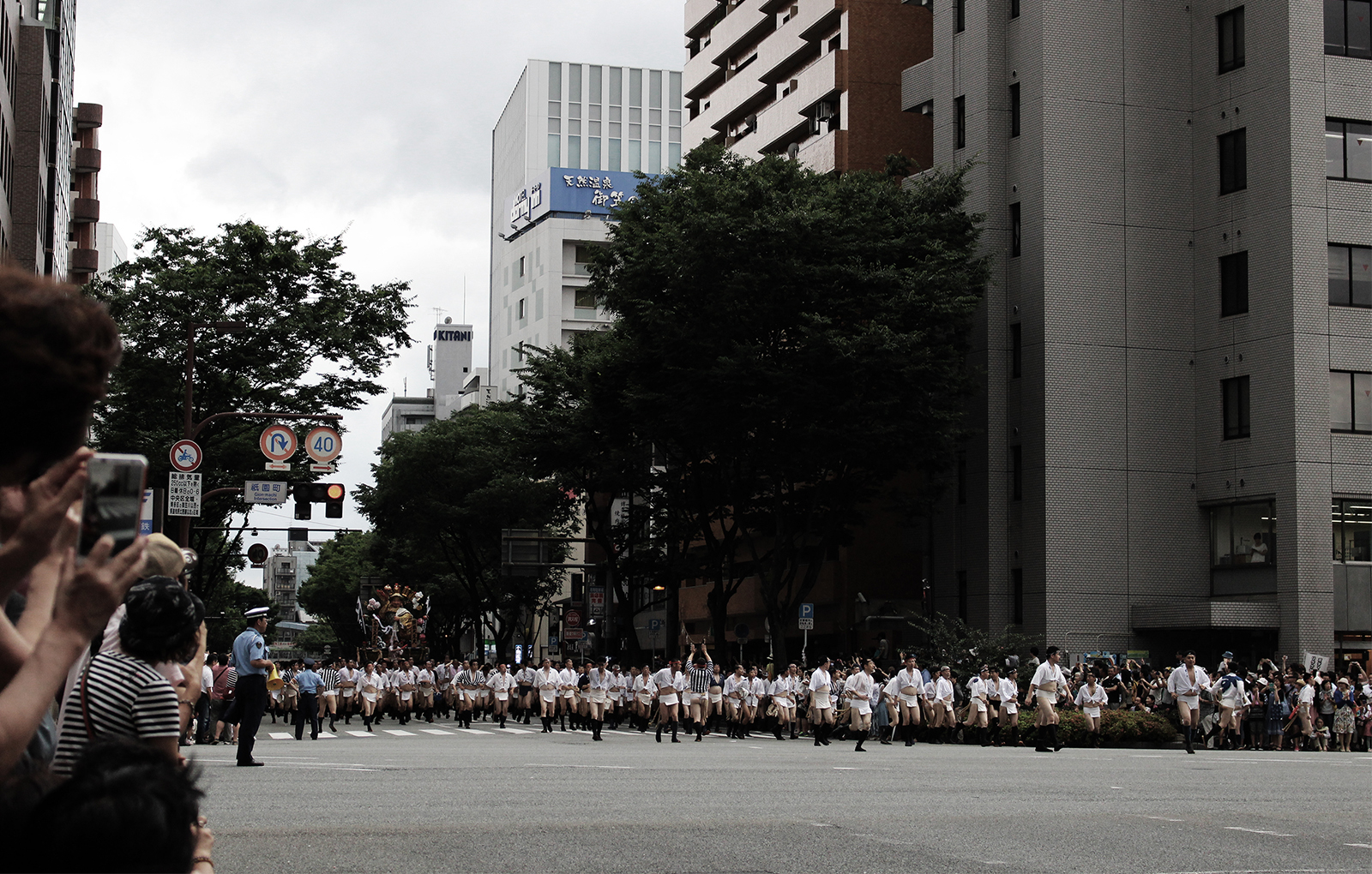
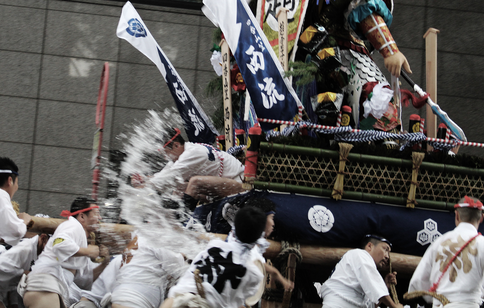
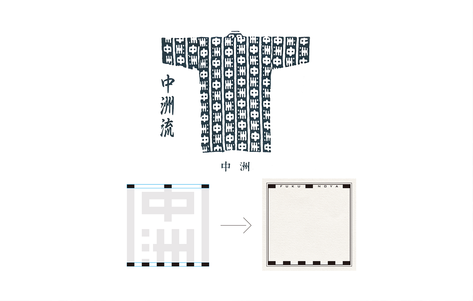
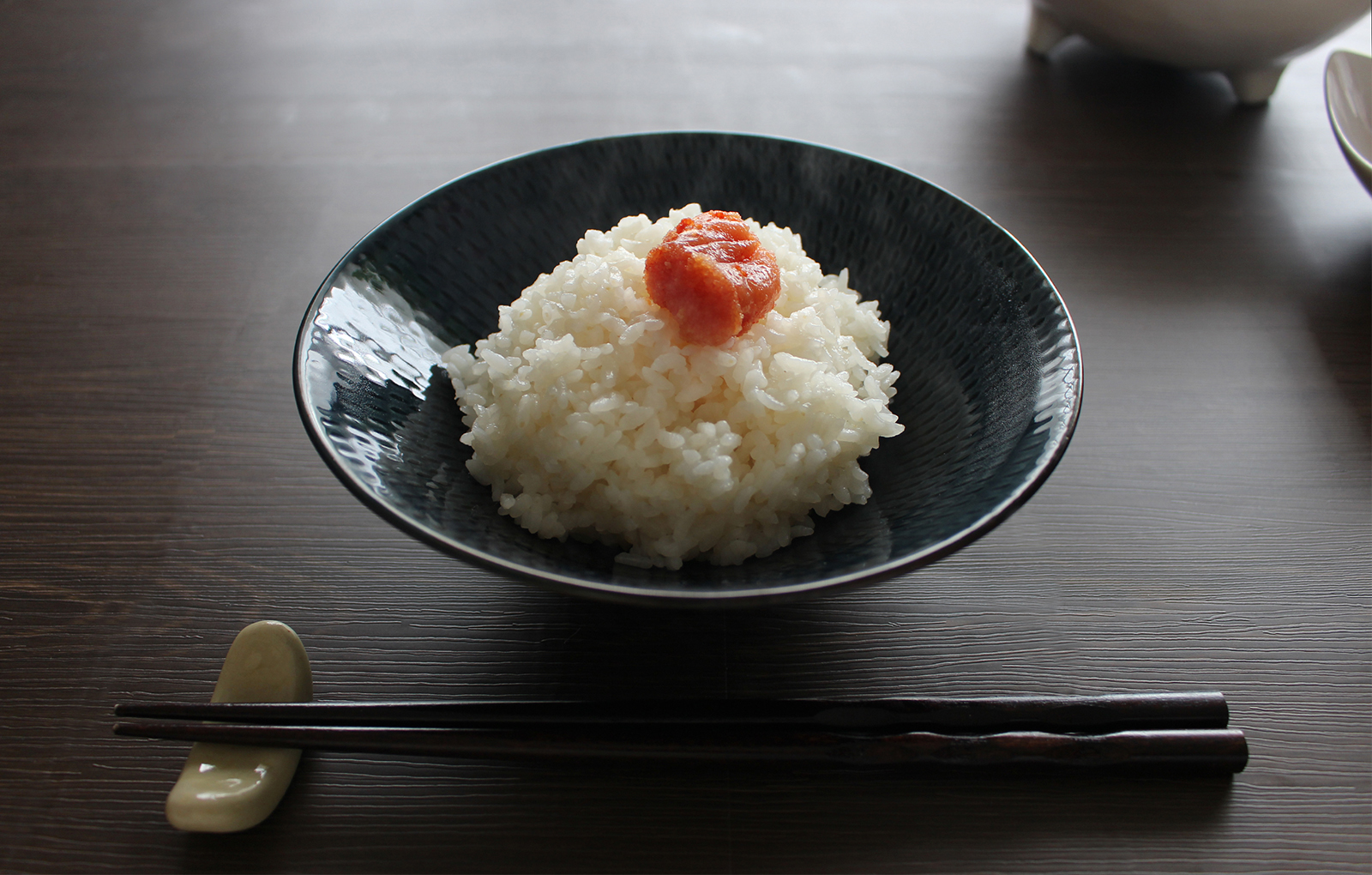
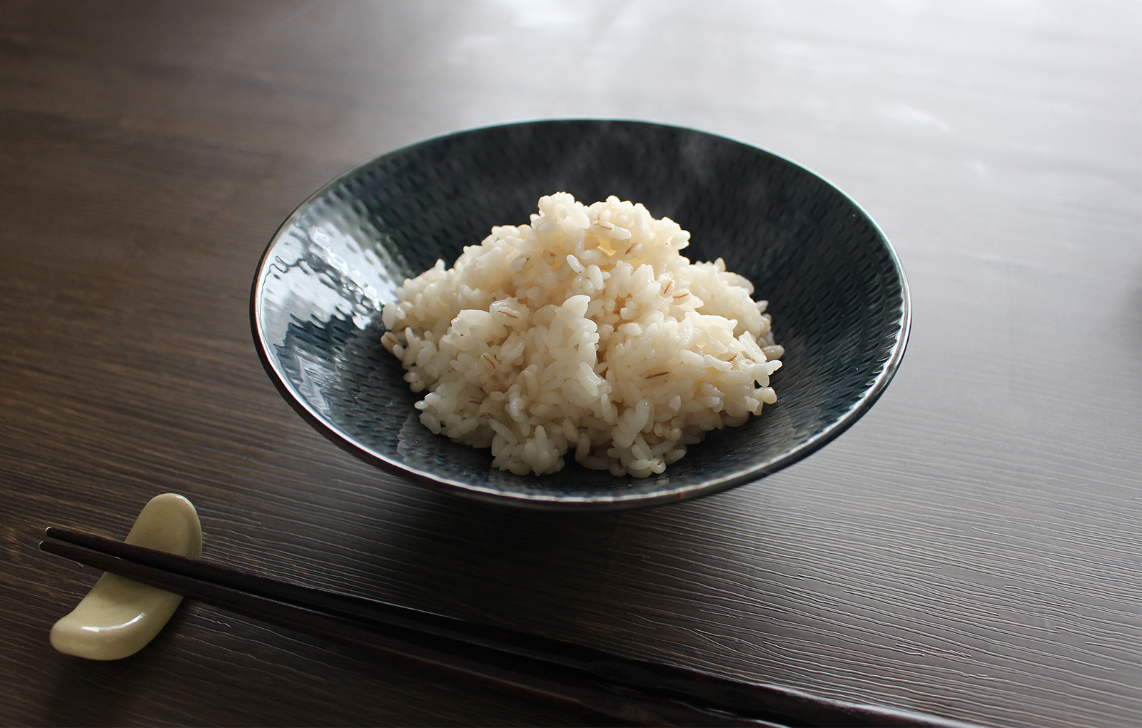
At the time of FUKUYA’s founding, the staple food in Japan was “rice”. In order to cherish the origins of its founding, the new symbol mark is the icon of the staple food in Japan, “Plump rice” which is represented by the Japanese letter of “FU” (It’s the initial of the brand name). The package incorporates the thought of the founder Toshio Kawahara who was involved in the formation of the Nakasu style in the Hakata Gion Yamakasa Festival and was designed with a part of the Nakasu mark of Nakasu style’s Happi* coat as an element. The brand book was designed to resemble a picture book in which the new symbol changes each time the page is turned.
*Happi is a traditional costume for the festival.
ふくや創業の時代、日本の主食は「白飯」でした。その創業時の原点を大切にするため新しいシンボルマークは日本の食卓のアイコンとして“ふっくらとした白飯”をブランド名の頭文字「ふ」で表現しました。パッケージは、創業者川原俊夫さんが博多祇園山笠の中洲流の結成に携わっていた創業当時の想いを取り入れ、中洲流の長法被の柄「中州」マークの一部を要素に入れた設計にしました。ブランドブックは、新しいシンボルマークがページをめくるごとに変化していく絵本のような内容にしました。
Credit /
Client: Fukuya Co.,Ltd
Creative Direction: Daisuke Kobayashi (SUKEDACHI DESIGN)
Art Direction: Daisuke Kobayashi (SUKEDACHI DESIGN)
Design: Daisuke Kobayashi (SUKEDACHI DESIGN)
Illustration (Brand book): Rumiko Nanaumi
Copy (Brand book): Michiyo Kambe (Canbe-shokai)
204-3-21-4, NOMA, MINAMI-Ku,
FUKUOKA-City, Fukuoka, 815-0041, JAPAN