Continue to evolve.
進化をつづける。
Fukuya’s signature product, “Aji no Mentaiko,” was the first to manufacture and sell karashi mentaiko. It was launched in 1957 and became a Hakata specialty.
As customers’ ages and lifestyles change with the times, together with Fukuya, SUKEDACHI DESIGN was in charge of redesigning packages that are trusted by customers (maintainability) and can respond to the times (trends, quality).
初めて明太子を製造販売したふくやの看板商品「味の明太子」。1957年から売り出され博多名物として定着するきっかけとなった商品です。
時代とともに、お客様の年齢やライフスタイルが変化していく中で、これまでのお客様からの信頼(保守性)とともに、時代への対応(トレンド性・上質さ)できるパッケージとしてふくや様と一緒にパッケージのリデザインを担当しました。
Re-verify the uniqueness of FUKUYA.
ふくやらしさを再検証。
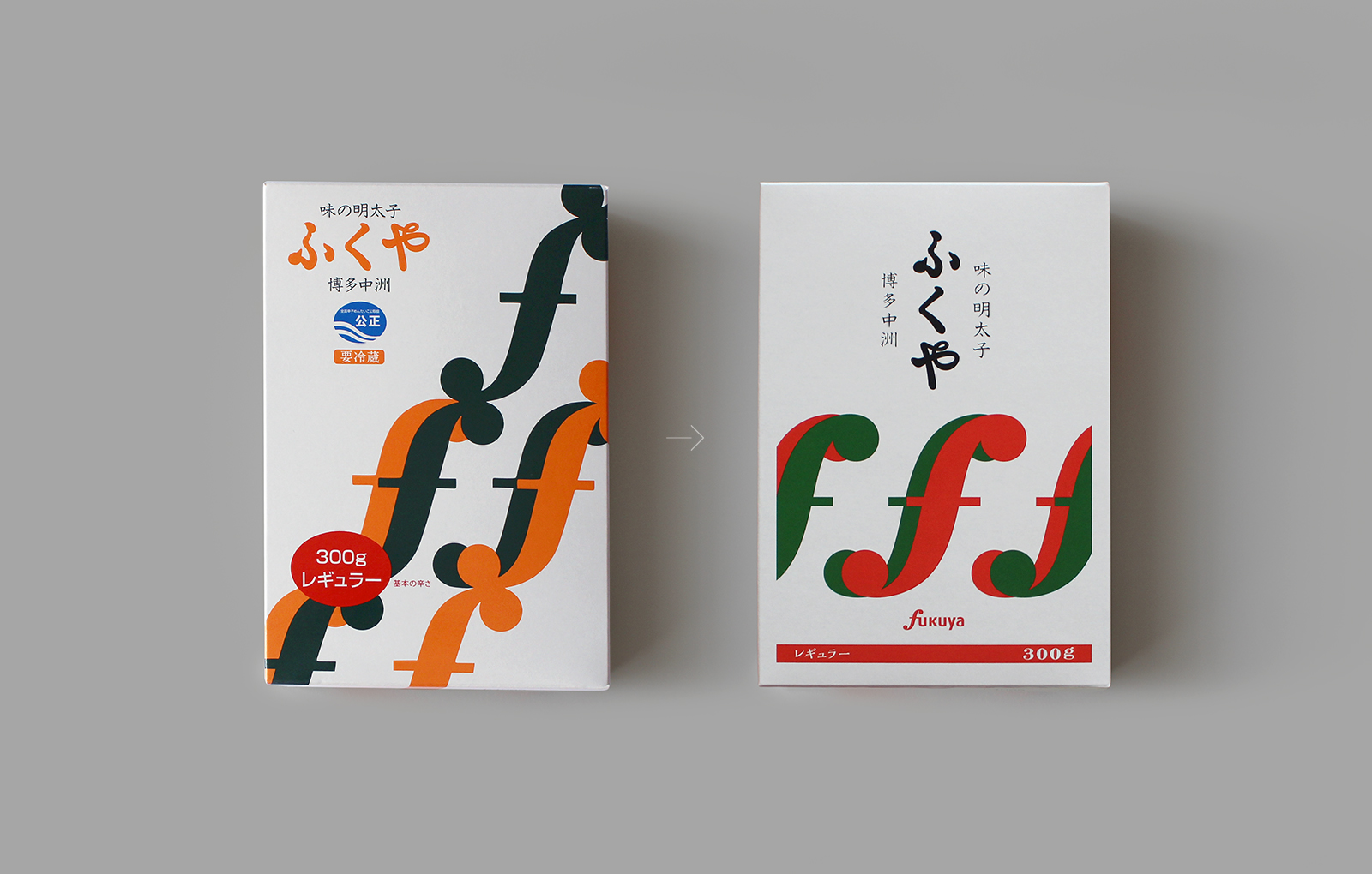
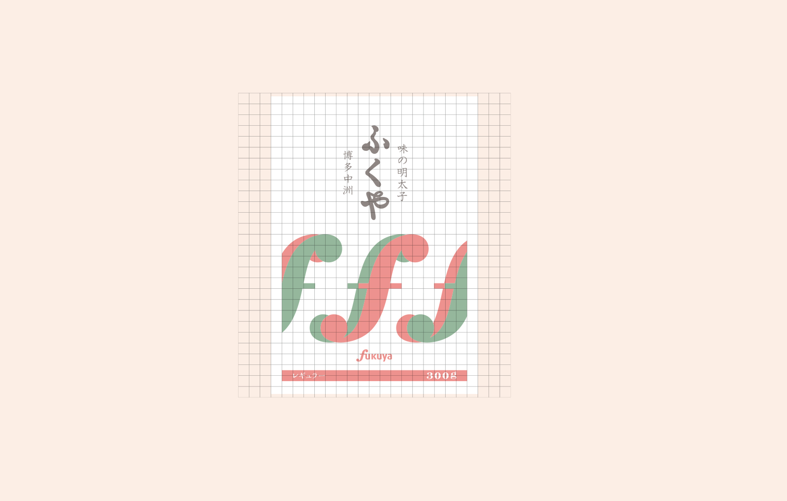
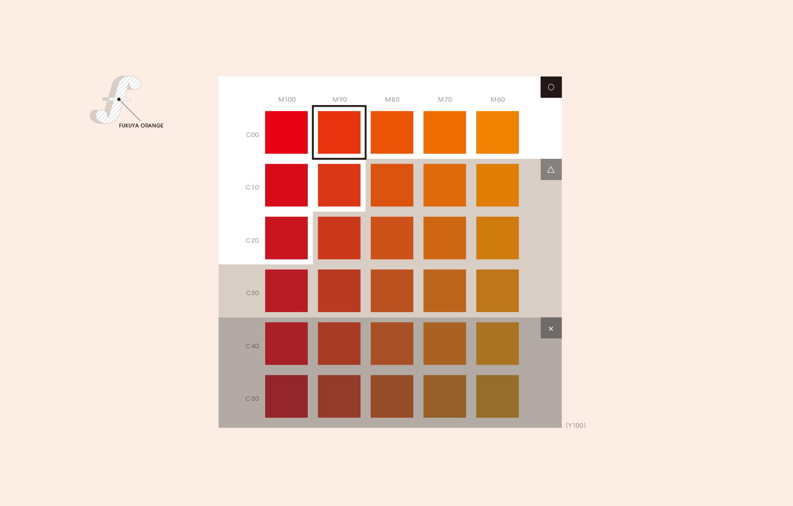
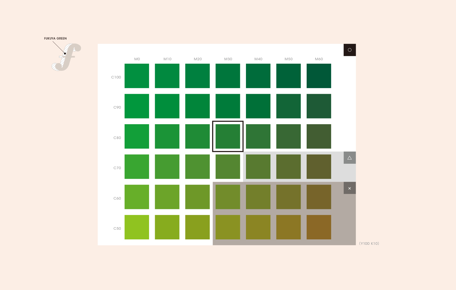
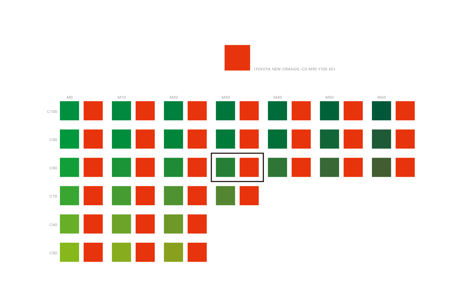
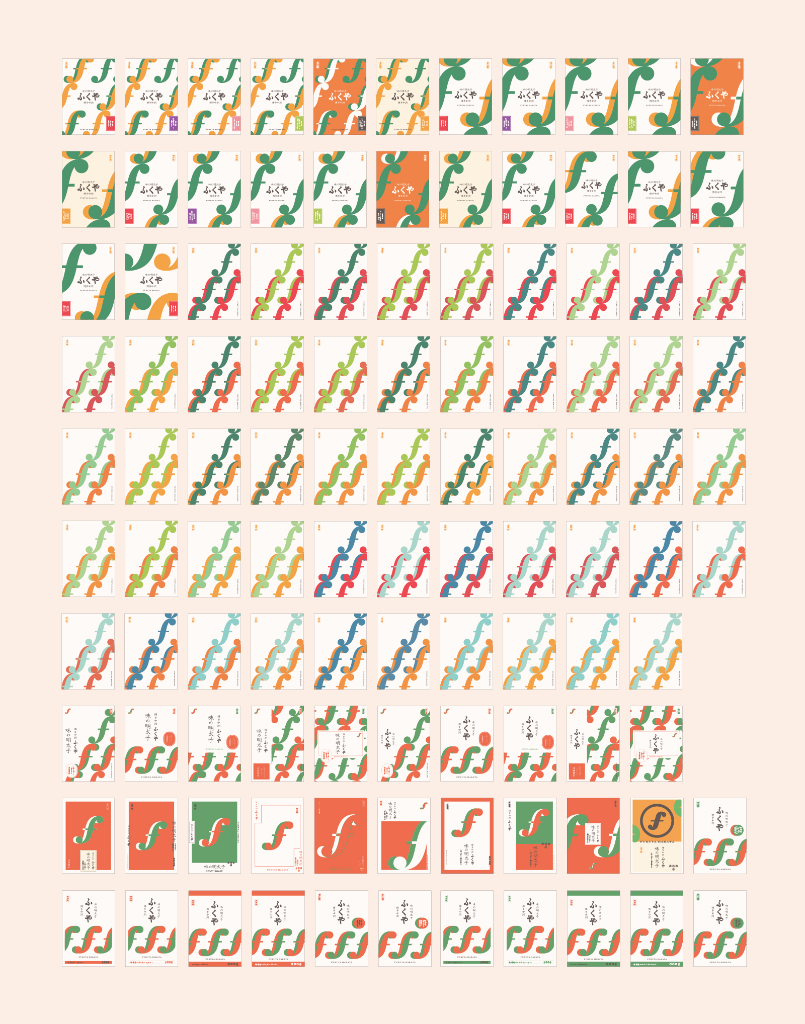
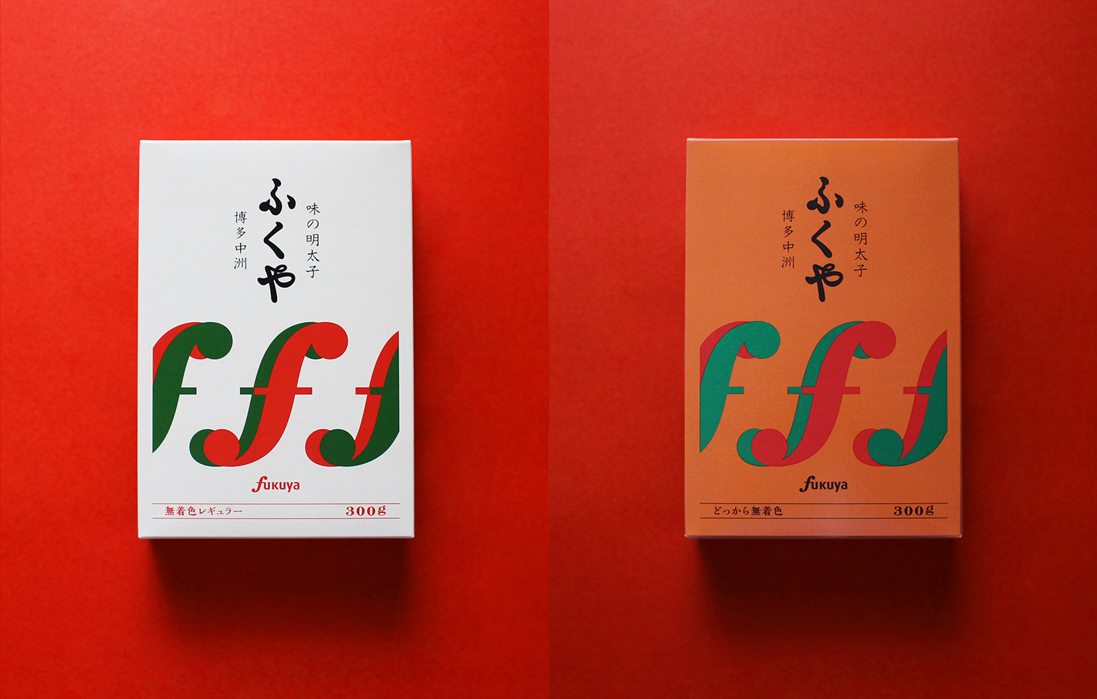
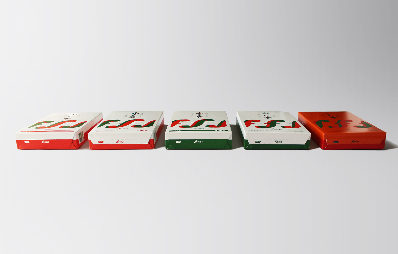
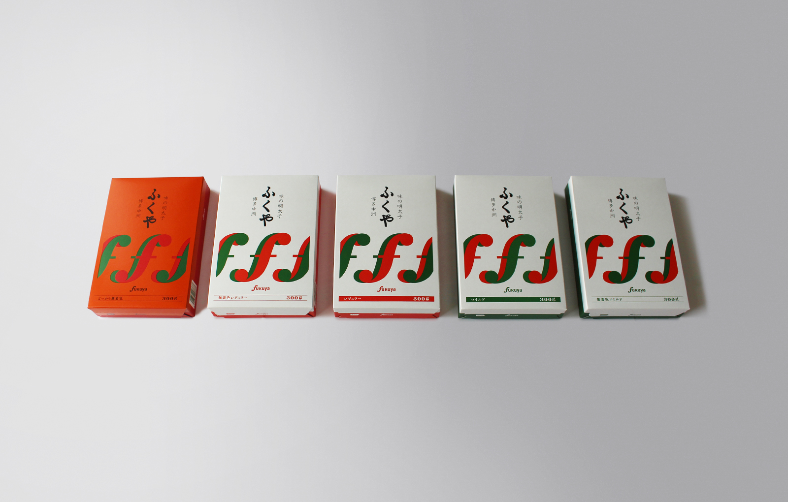
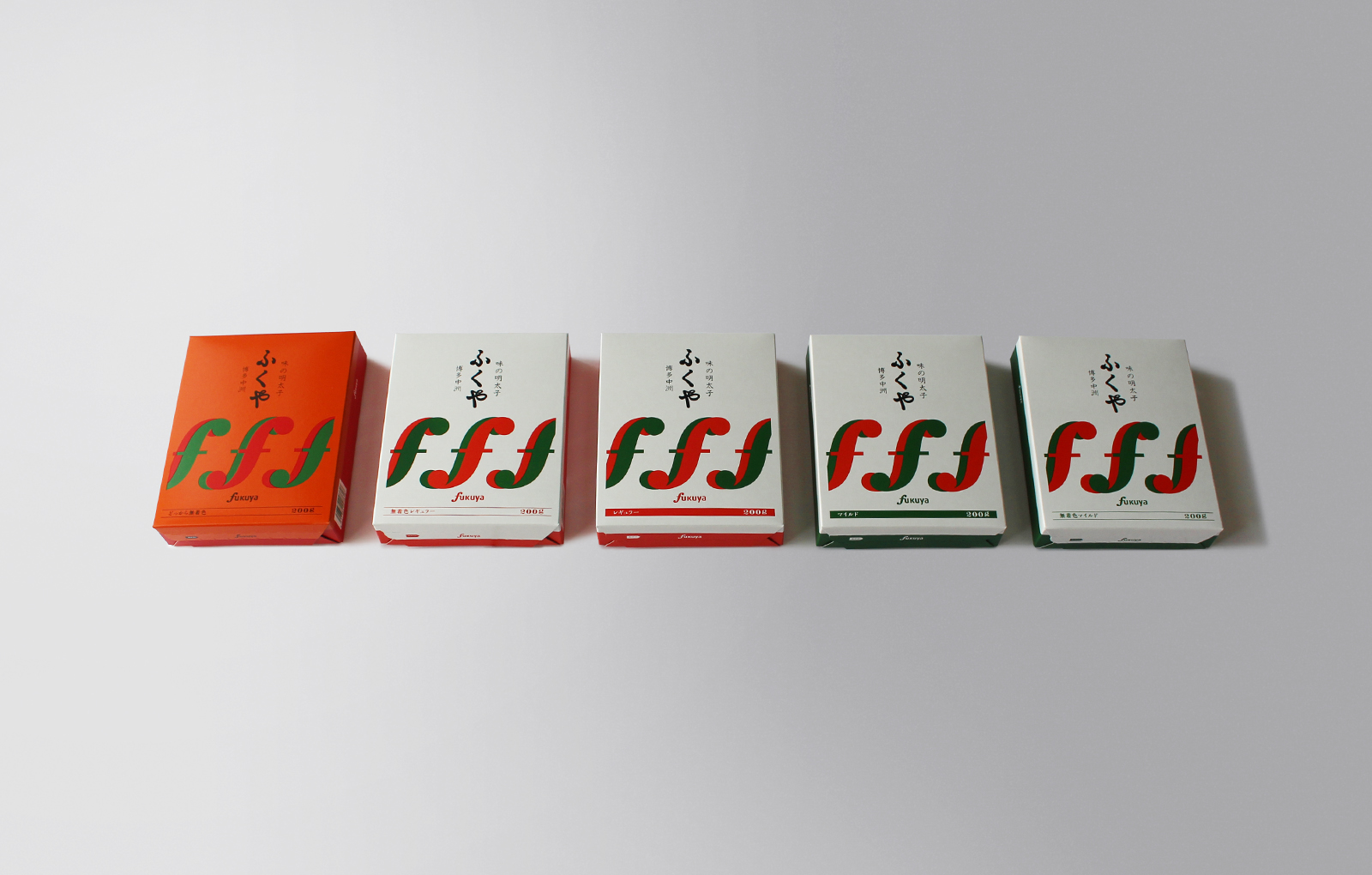
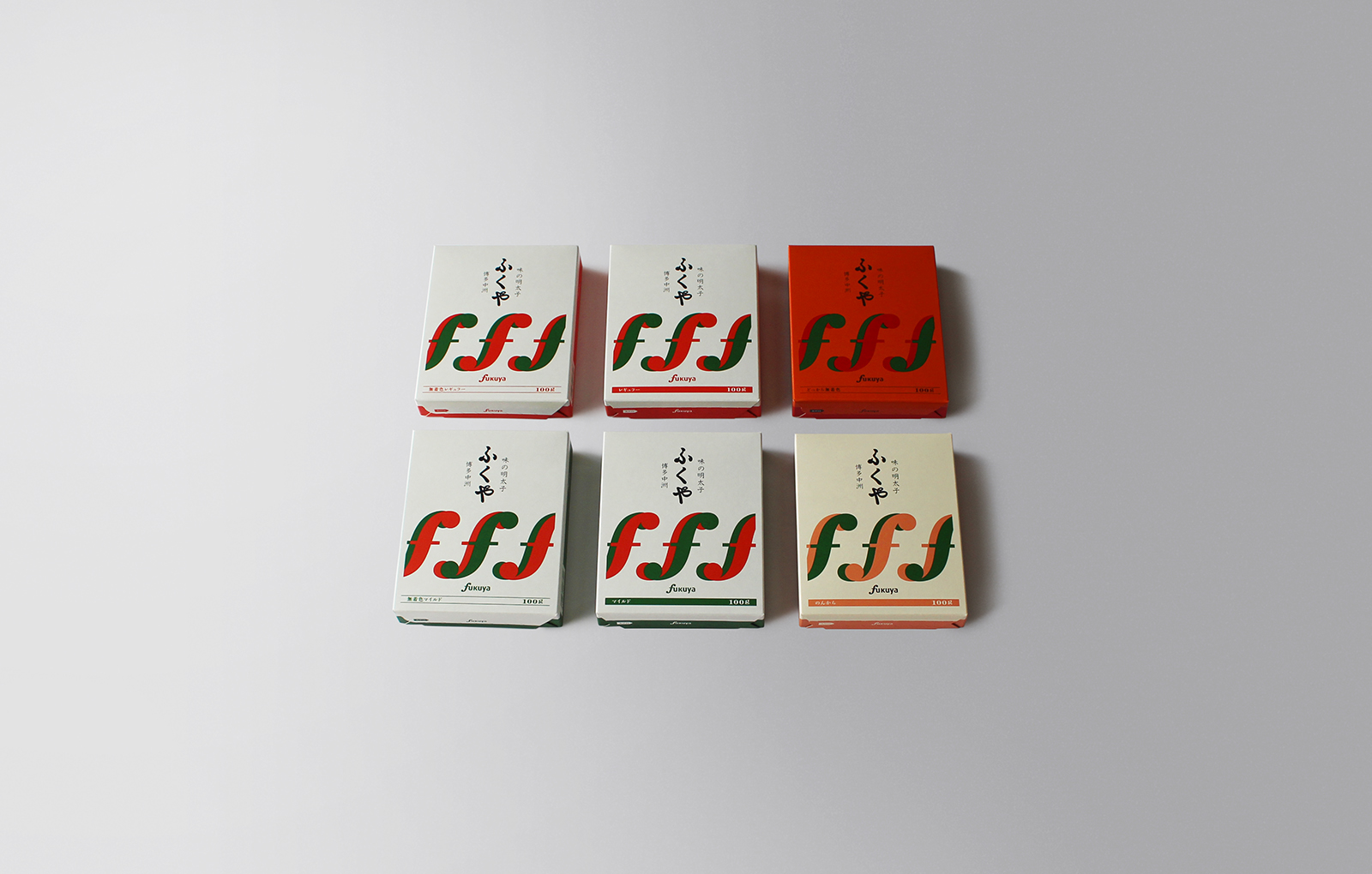
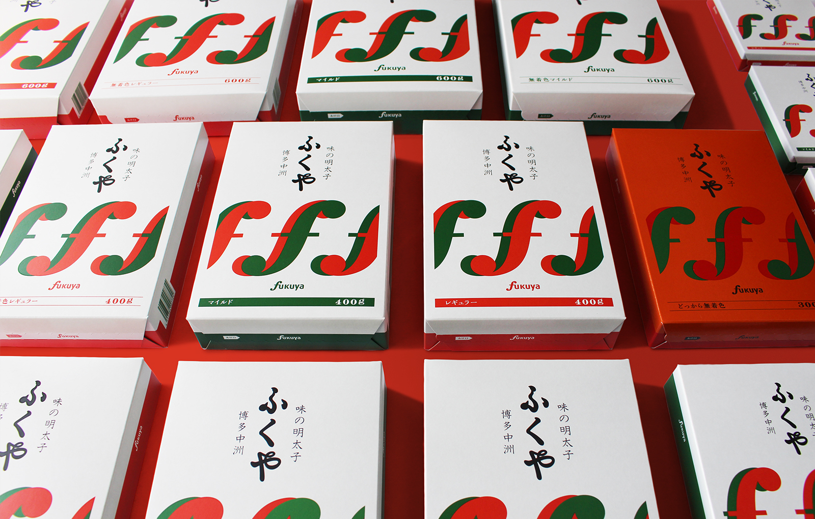
By changing the F-mark, which is the symbol of Fukuya, from the conventional textile type to the symbol type, the expression has been corrected to make the face of the brand more confident and trusting. The color has been changed from the traditional slightly bright and pop impression to the redness and greenness of the pepper, which is a food idea.
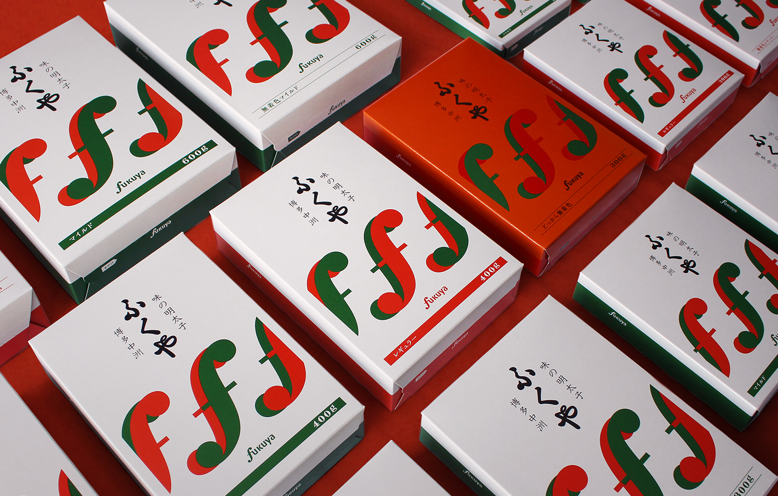
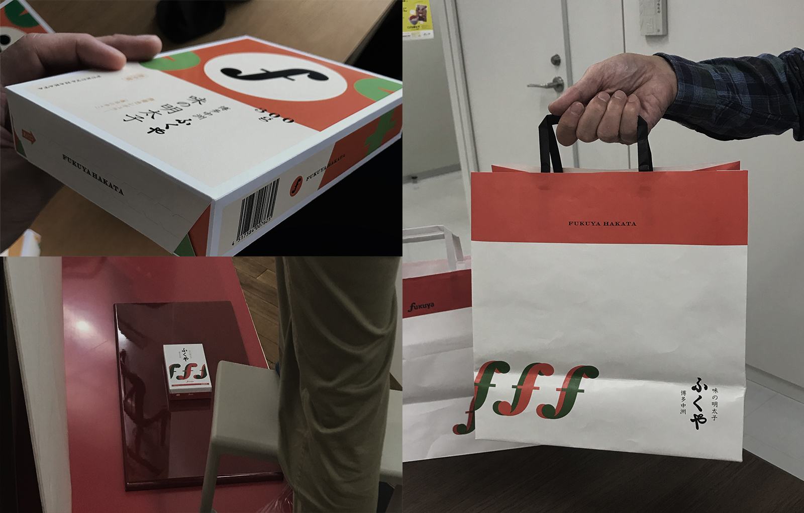
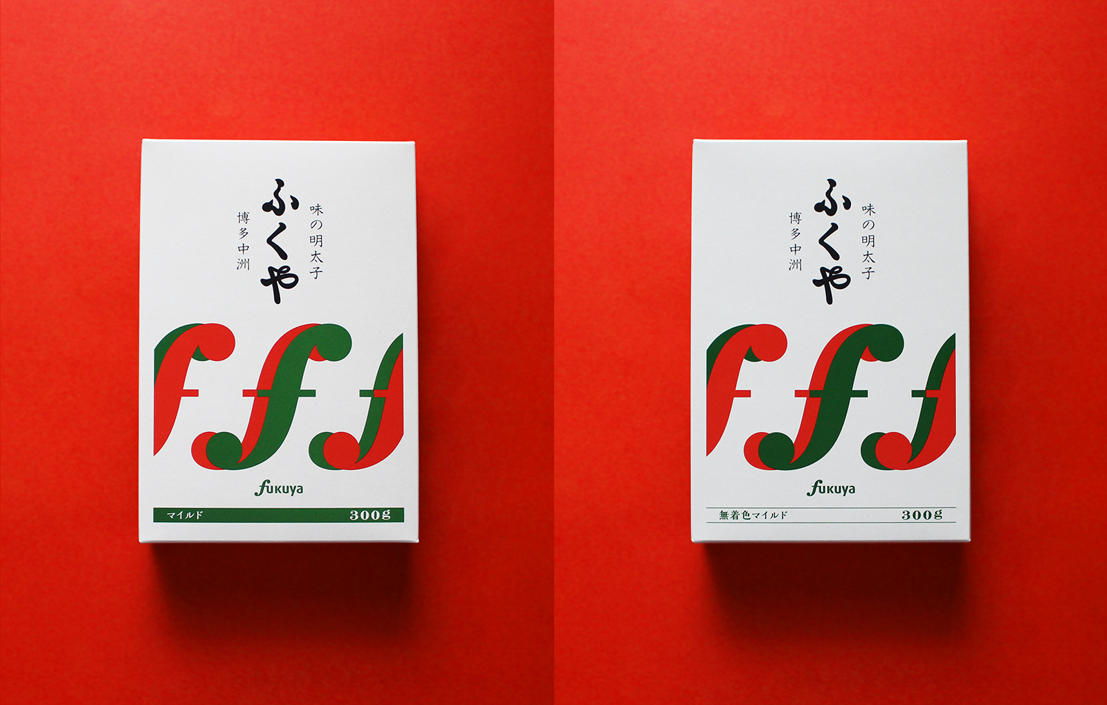
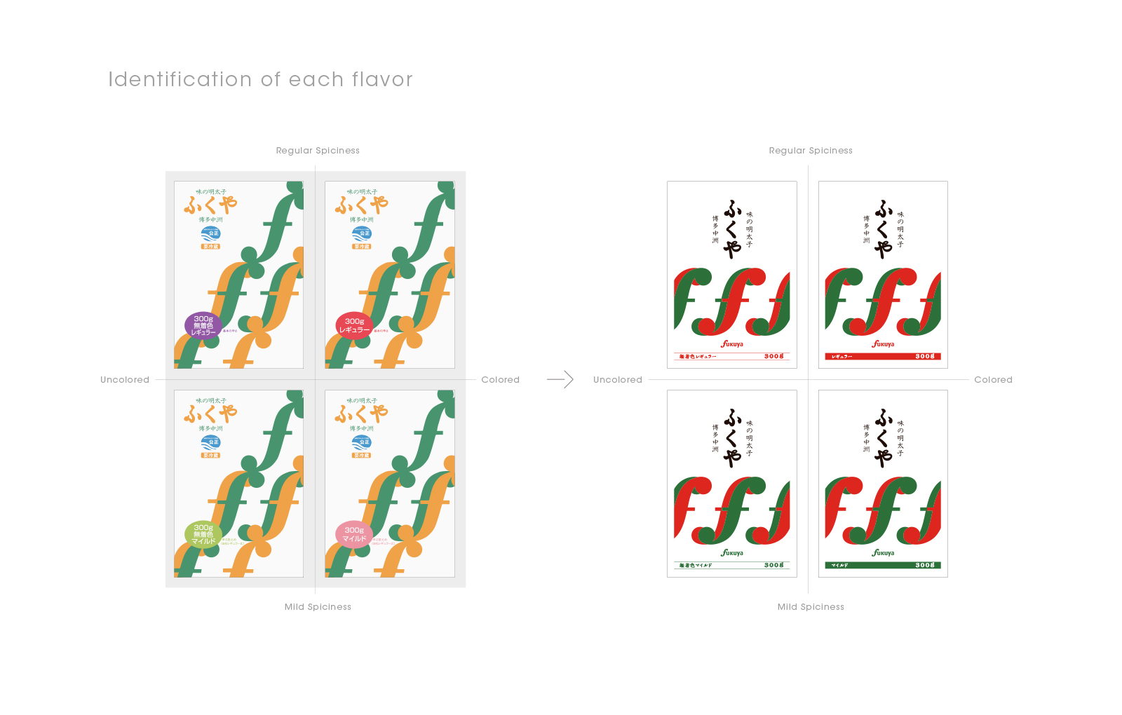
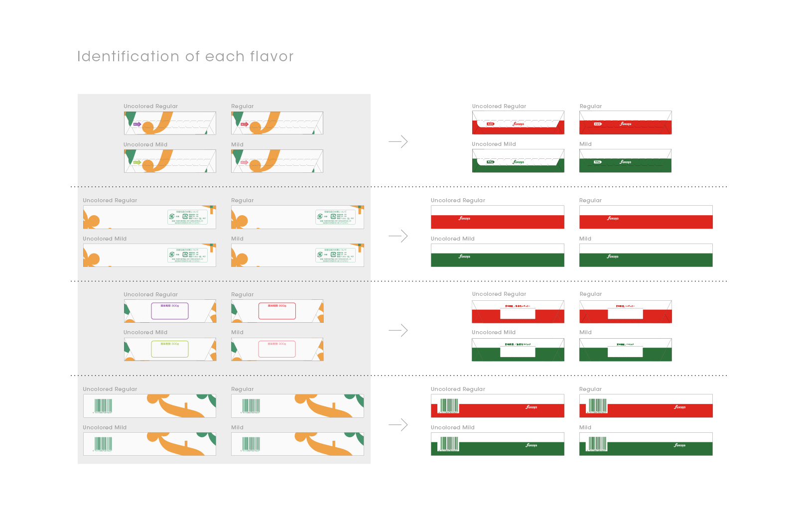
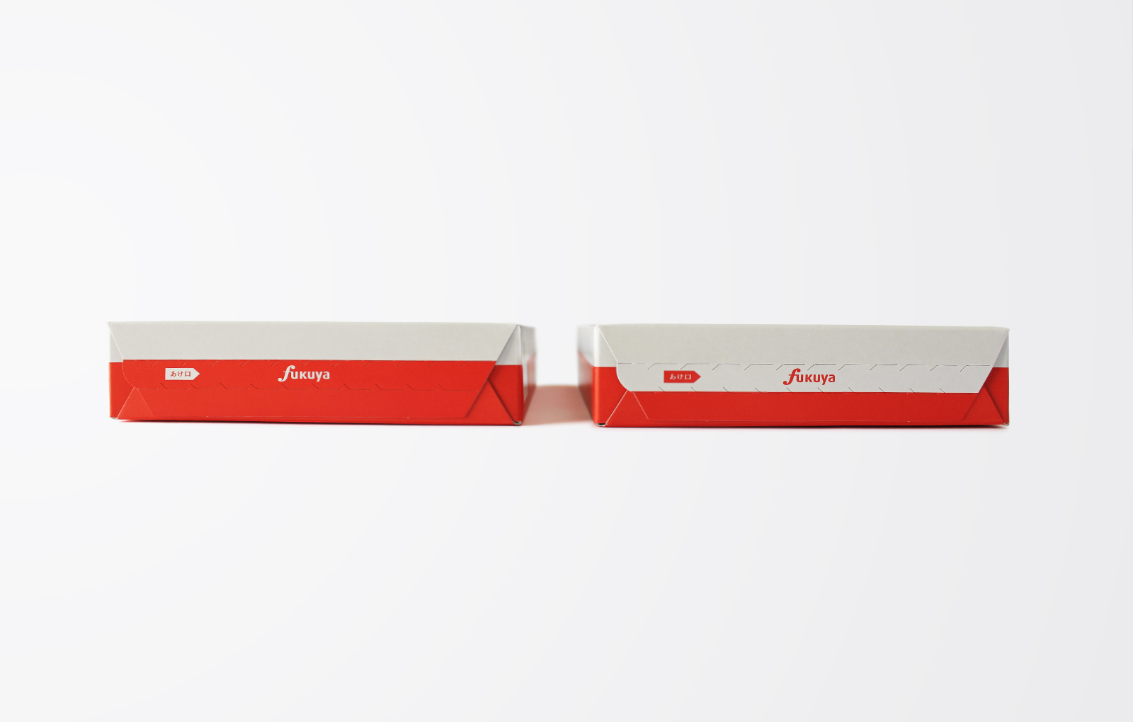
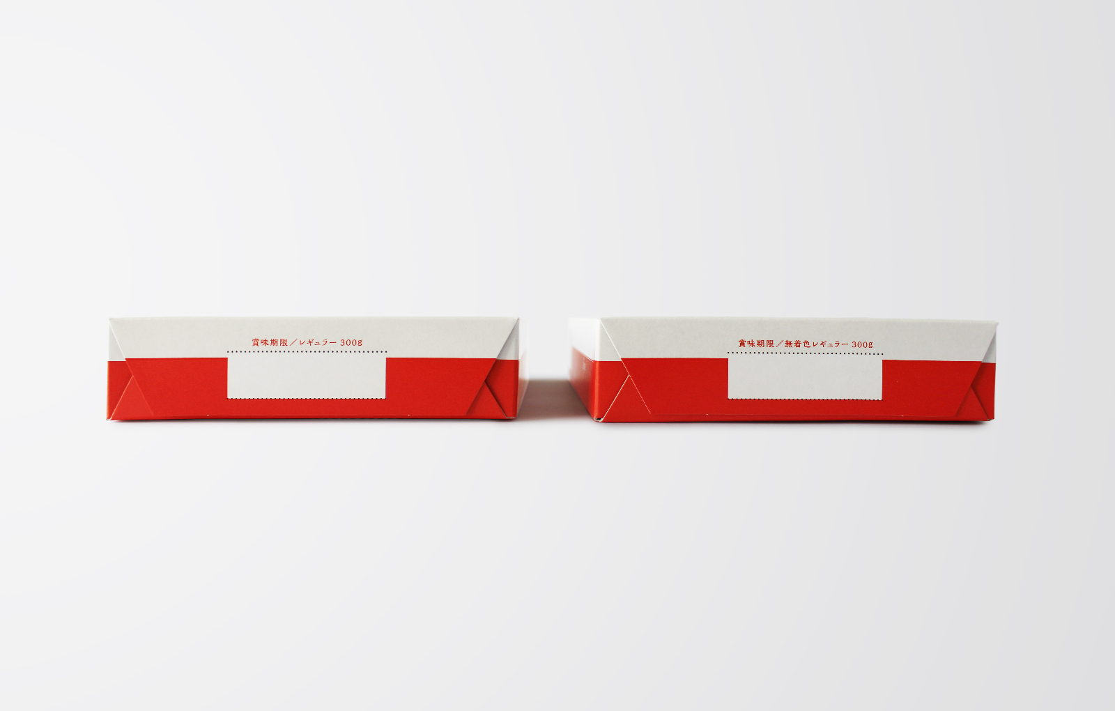
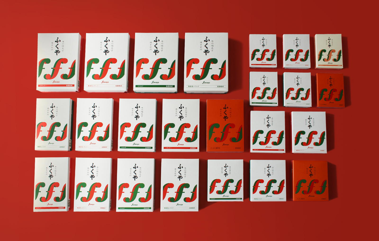
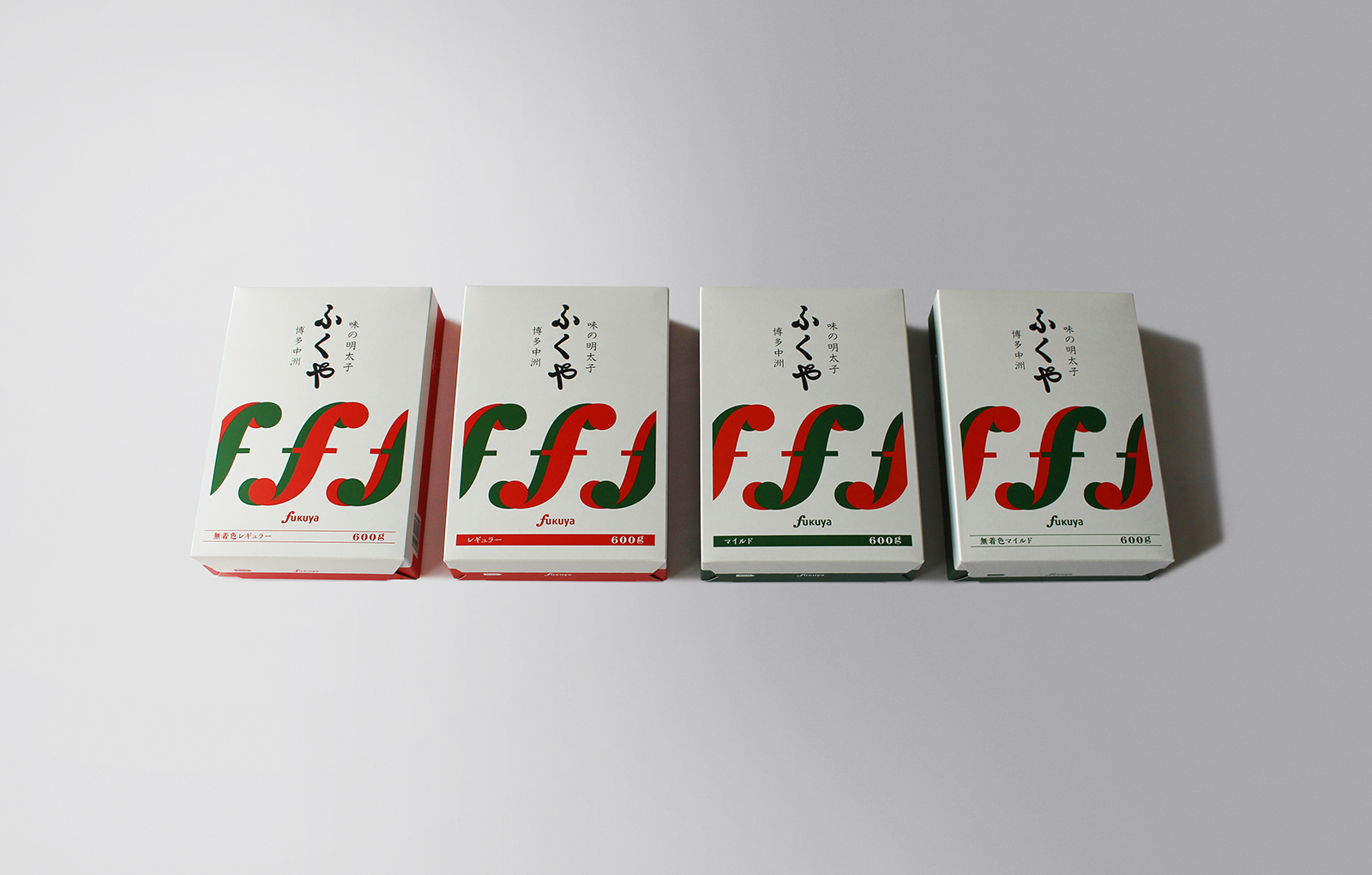
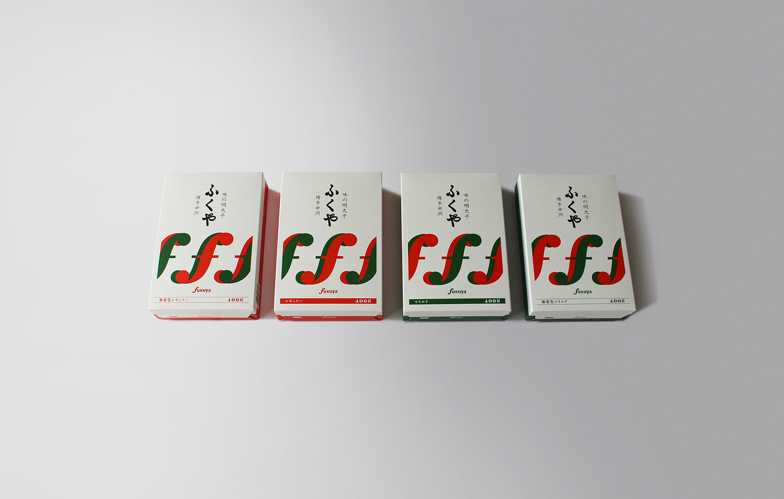
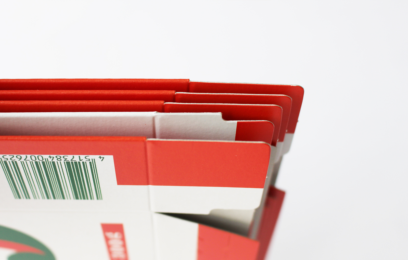
Organize the information on the surface of the package, verify multiple placements with names and symbols as the main, and reset the rules for identifying each flavor that does not affect the main impression. In order to make it easier for not only customers but also store staff to handle flavor identification at retail stores, we have reflected the identification rules in the side design based on the content of the exchange of opinions with the staff. At the factory where the products are packaged, the side design was adjusted following the opinion that the staff wanted it to be easy to understand whether the folded package was oriented correctly or not.
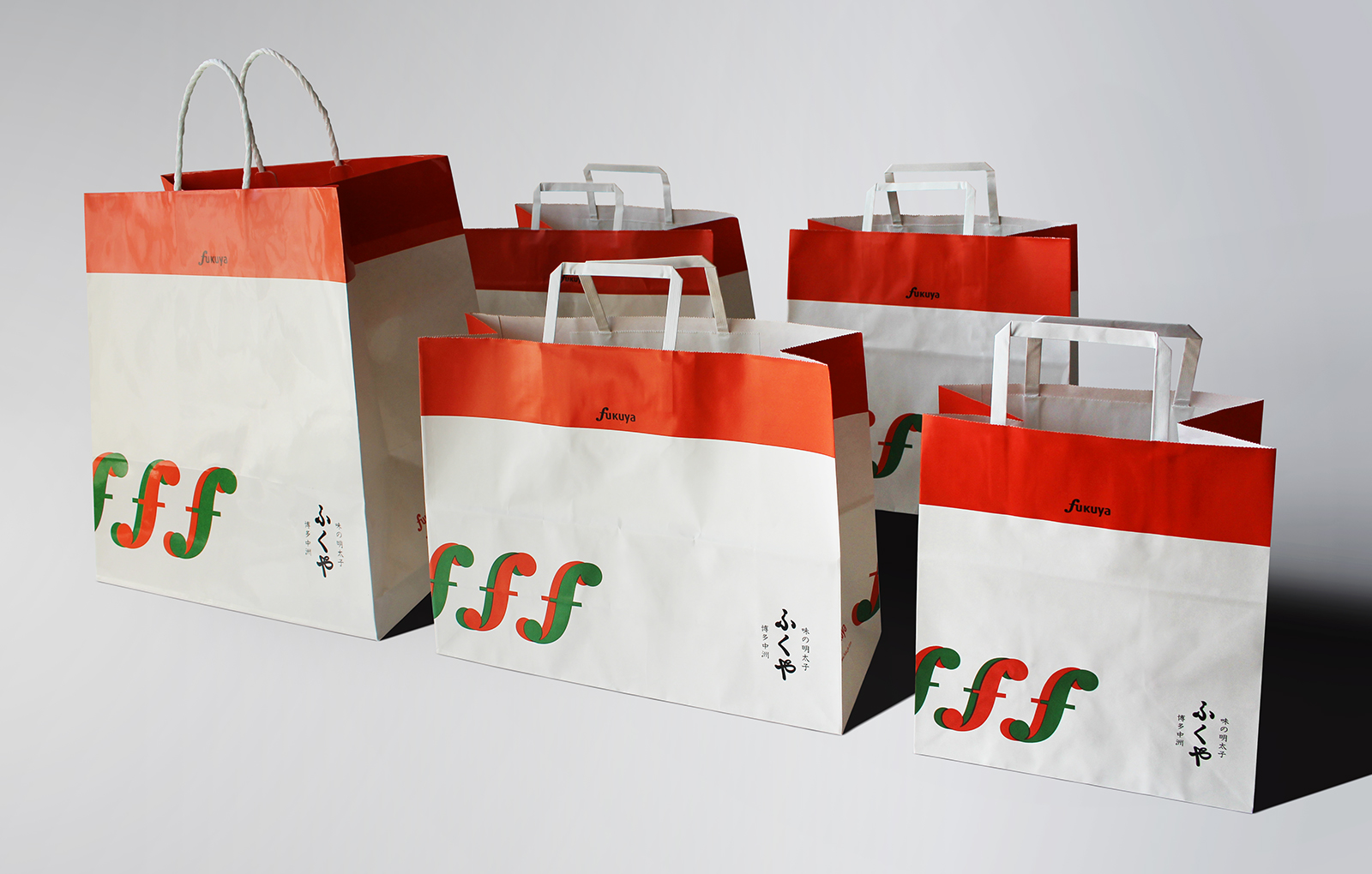
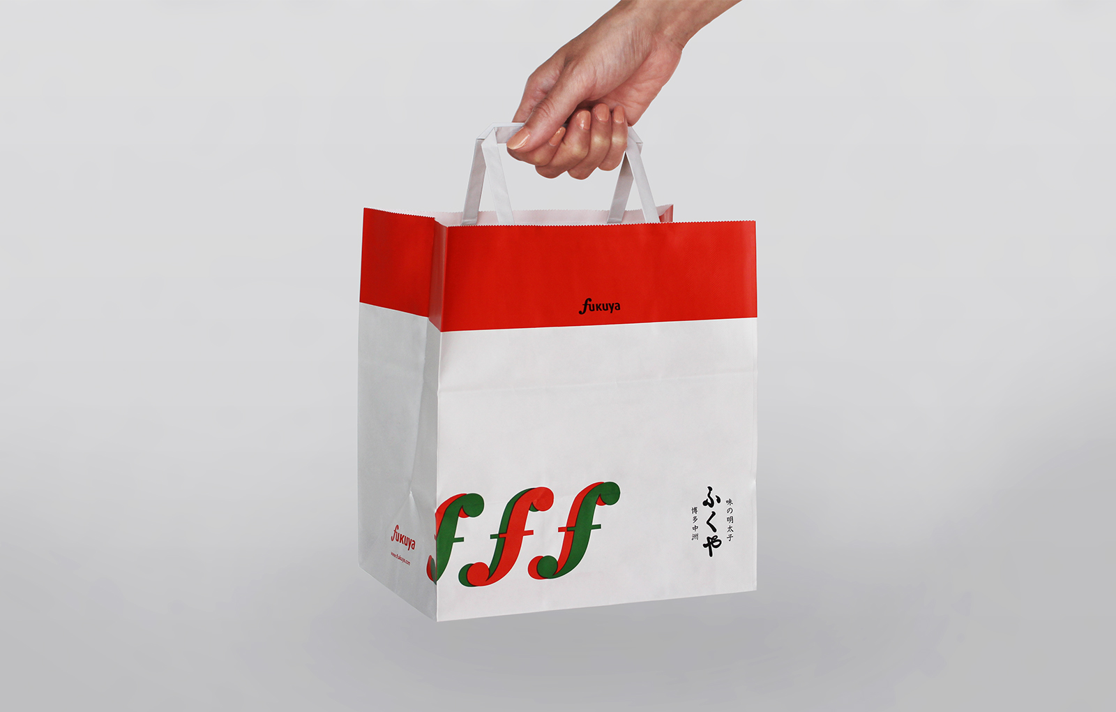
The design that shows the three F marks as symbols is reflected in the design of the new paper bag and vinyl bag.
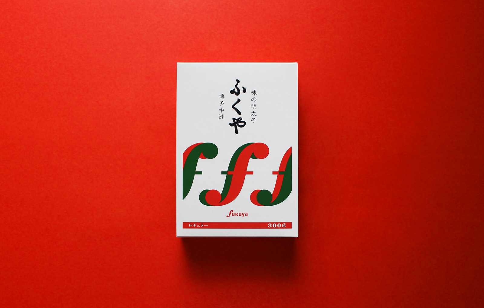
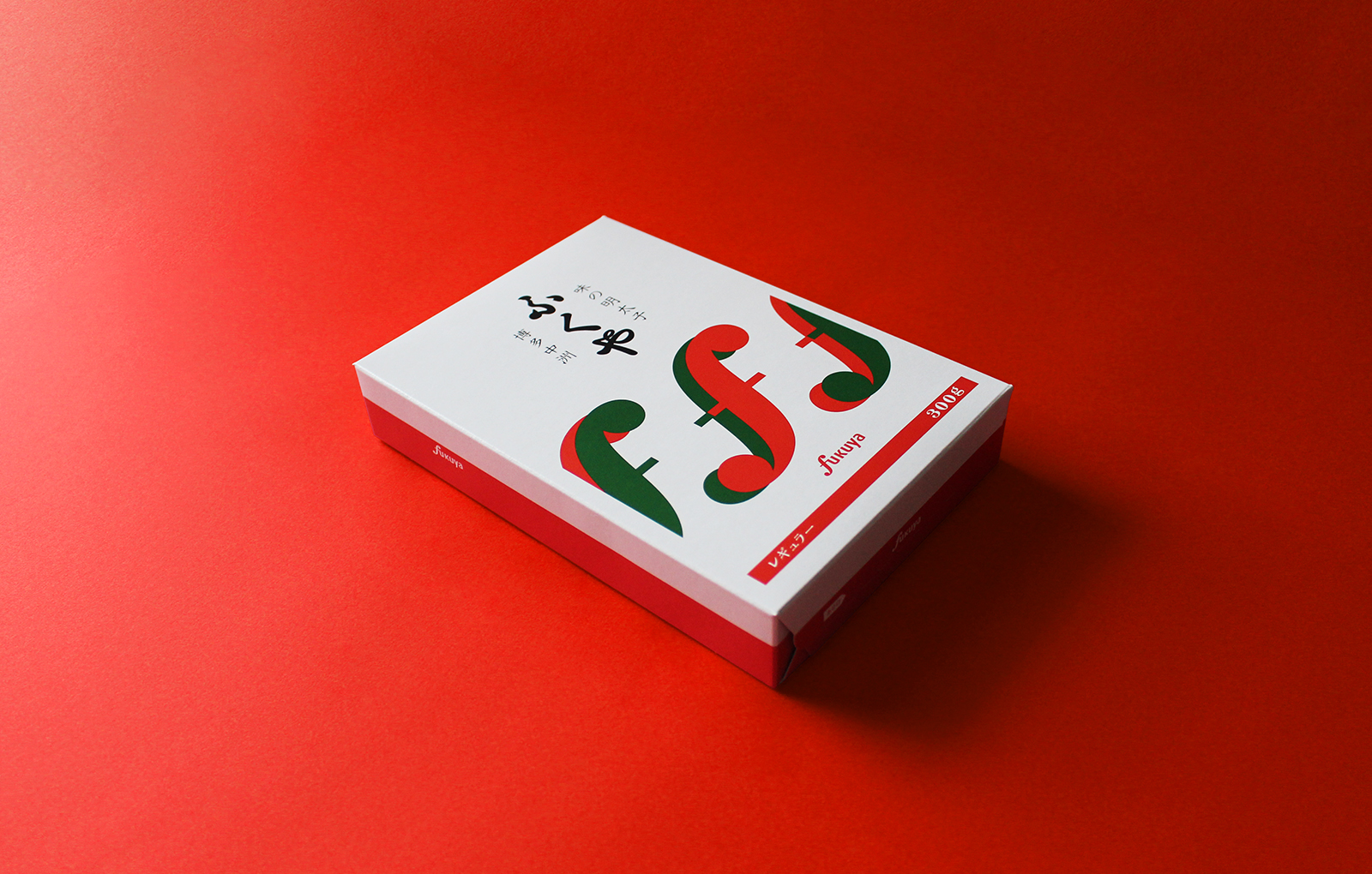
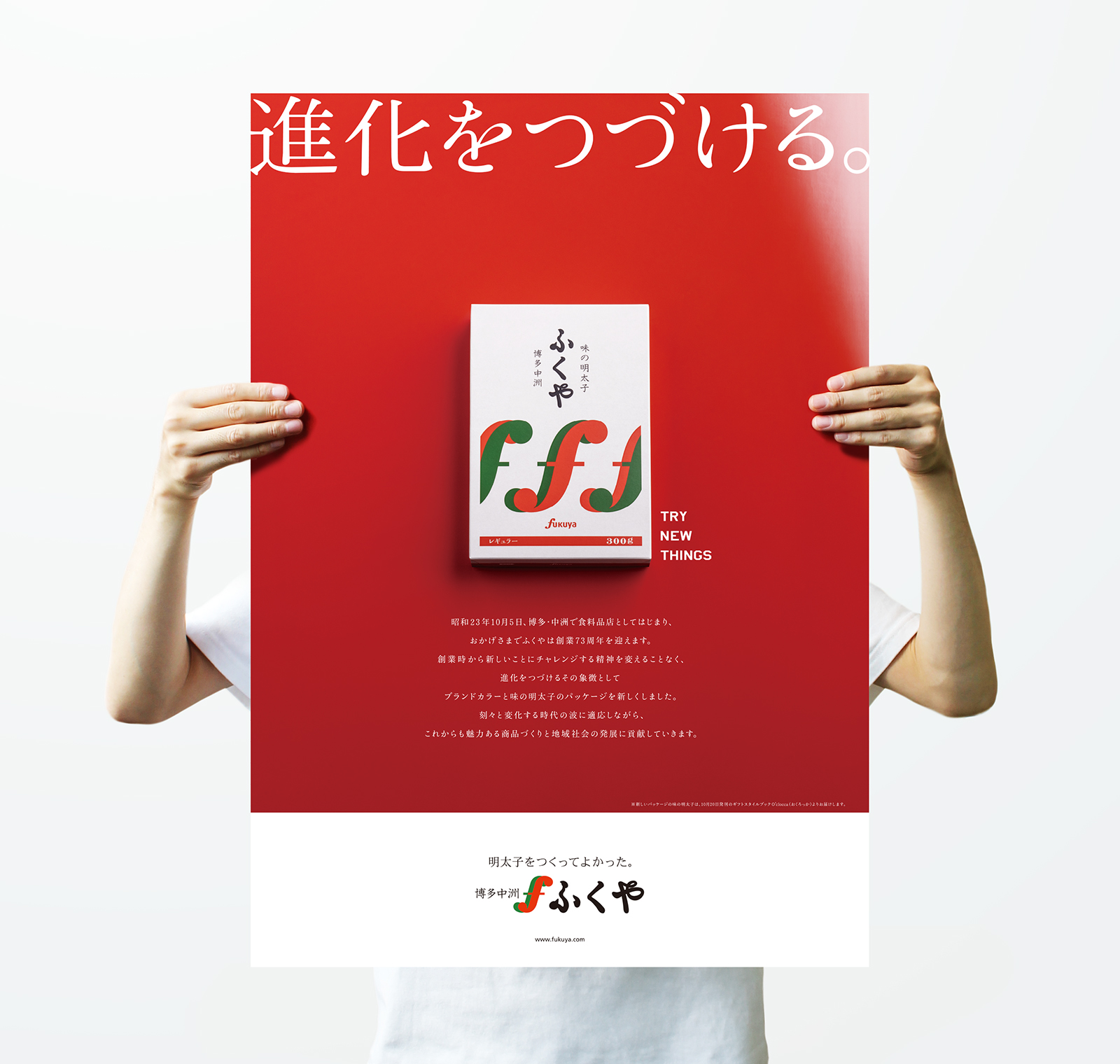
The poster uses a package photo with a vermilion background of lacquer as a visual to express Fukuya, which continues to evolve with high quality and new brand colors.
Fukuya continues to evolve without changing the spirit of taking on new challenges from the time of its founding.
We would like to thank the people concerned about being in charge of redesigning the new brand color and the new “Aji no Mentaiko” package, which symbolizes Fukuya’s challenging spirit.
ふくやのシンボルであるエフマークを従来のテキスタイル型から、シンボル型に変更。ブランドの顔として堂々とした自信と信頼を感じる見え方へ軌道修正しました。色味は、従来のやや鮮やかでポップな印象から、食品着想である唐辛子の赤みと青みへ変更しました。
パッケージ表面の情報を整理し、名前とシンボルを主役にする案を複数検証しながら、その印象に影響を与えない各フレーバーの識別のルール化を再設定。販売店舗でフレーバーの識別をお客様だけでなく店舗スタッフもより扱いやすいように、スタッフとの意見交換ででた内容を元に側面のデザインでも識別のルールを反映していきました。商品をパッケージ化する工場では、折りたたまれたパッケージの向きが逆向きかどうかを分かりやすく工夫してほしいという意見を踏襲し調整しました。
3つのエフマークをシンボルに見せるデザインは紙袋とビニール袋も新しいデザインに再設計。
ポスターのビジュアルは、本漆の朱色を背景にパッケージを撮影し、上質さと新しいブランドカラーで進化しつづけるふくやを表現しました。
創業時から新しいことにチャレンジする精神を変えることなく、進化をつづけるふくや。その象徴となる新しいブランドカラーと新しい「味の明太子」のパッケージのリデザインを担当できたことに、改めて関係者の方々に感謝いたします。

Credit /
Client: Fukuya Co., Ltd
Project Manager: Toshifumi Kakimoto (Fukuya Co., Ltd)
Art Direction: Daisuke Kobayashi (SUKEDACHI DESIGN)
Design: Daisuke Kobayashi (SUKEDACHI DESIGN)
Photo (Poster): Kazuhiro Yamane (Ultra graphics)
Retouch (Poster): Ai Ogasawara (Habibi)
204-3-21-4, NOMA, MINAMI-Ku,
FUKUOKA-City, Fukuoka, 815-0041, JAPAN