Discover New Ways to Enjoy Saga Sake: An Interactive Seminar
佐賀酒の新しい楽しみ方を発見する体験型セミナー
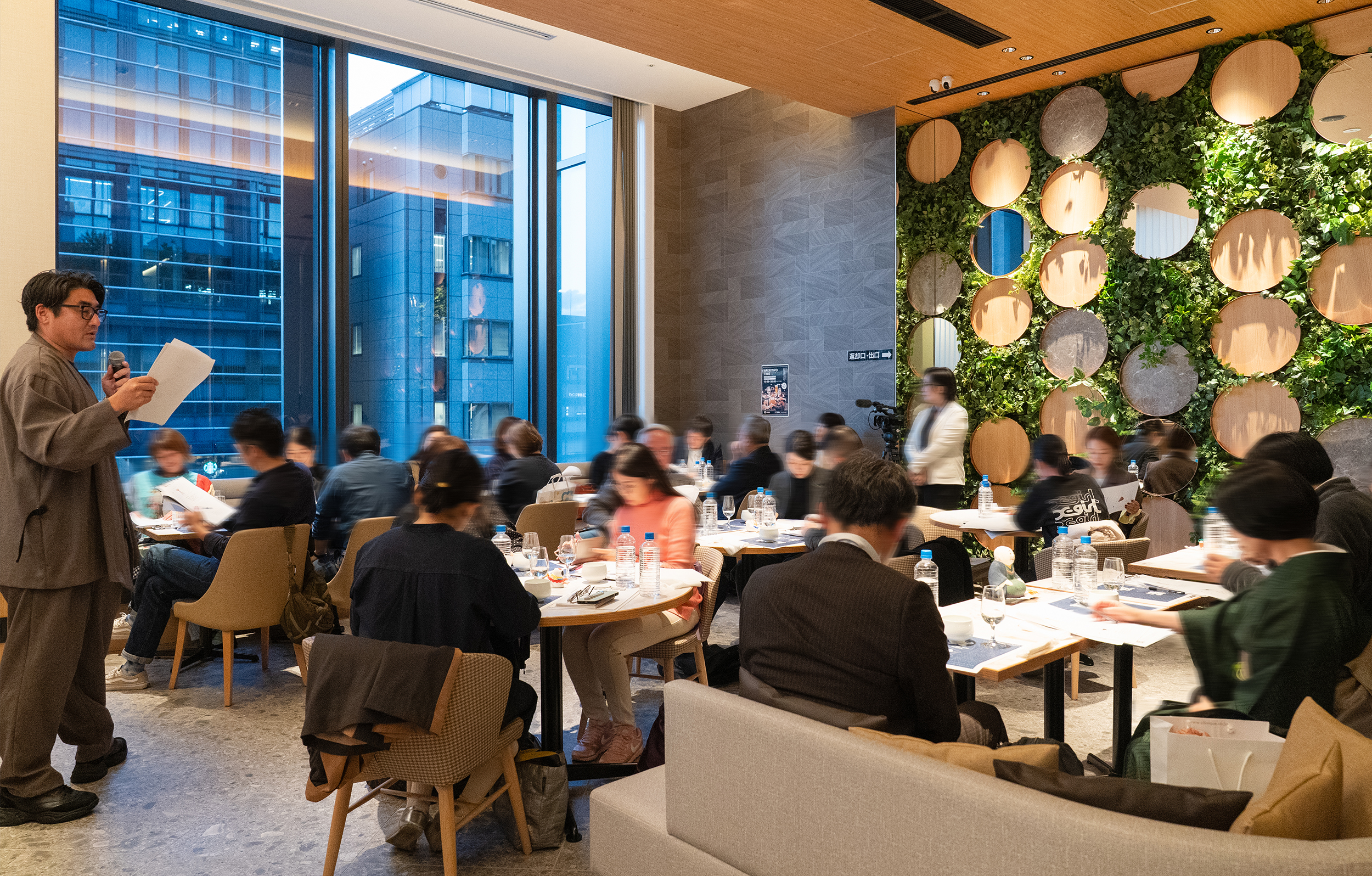
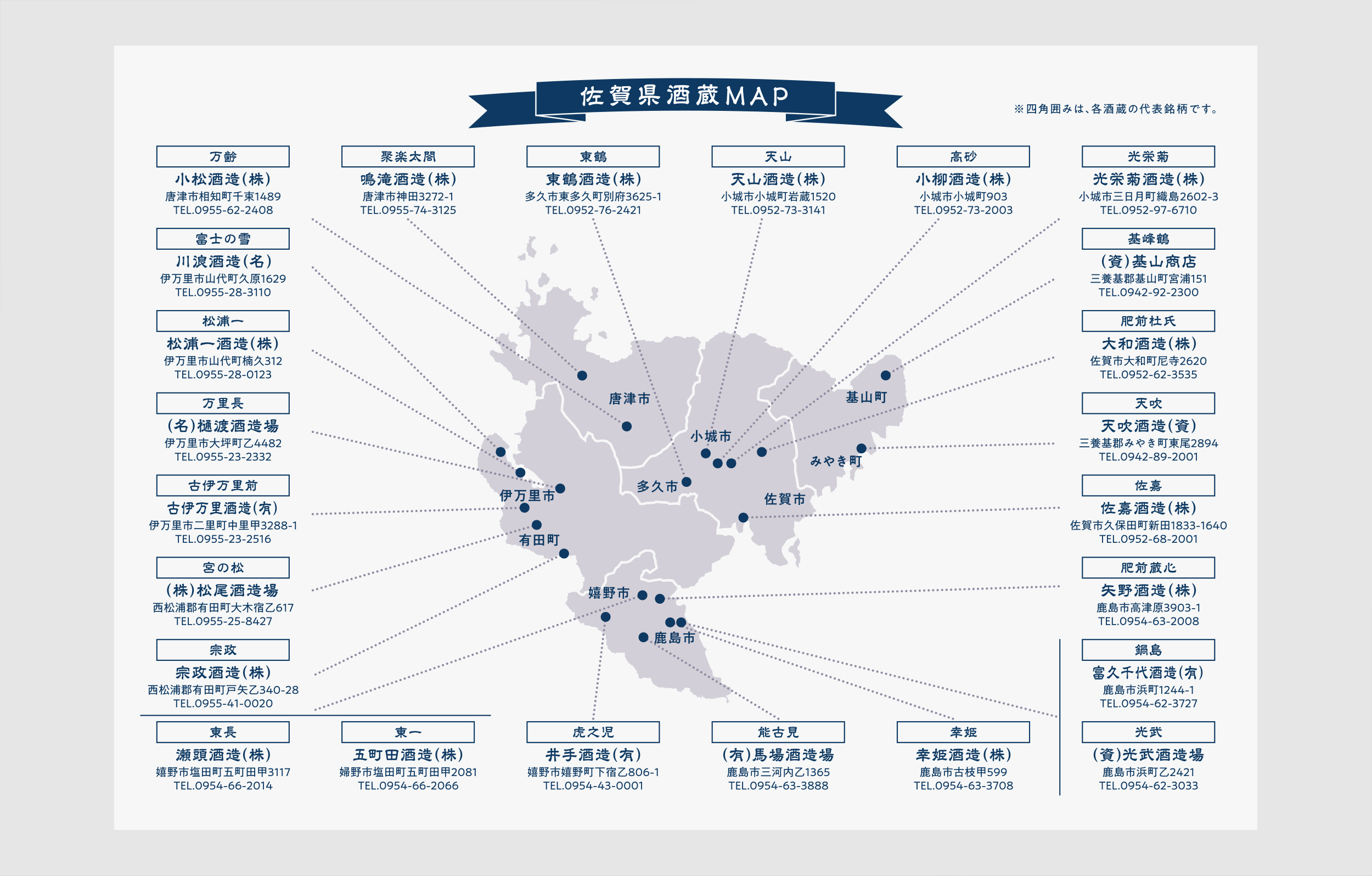
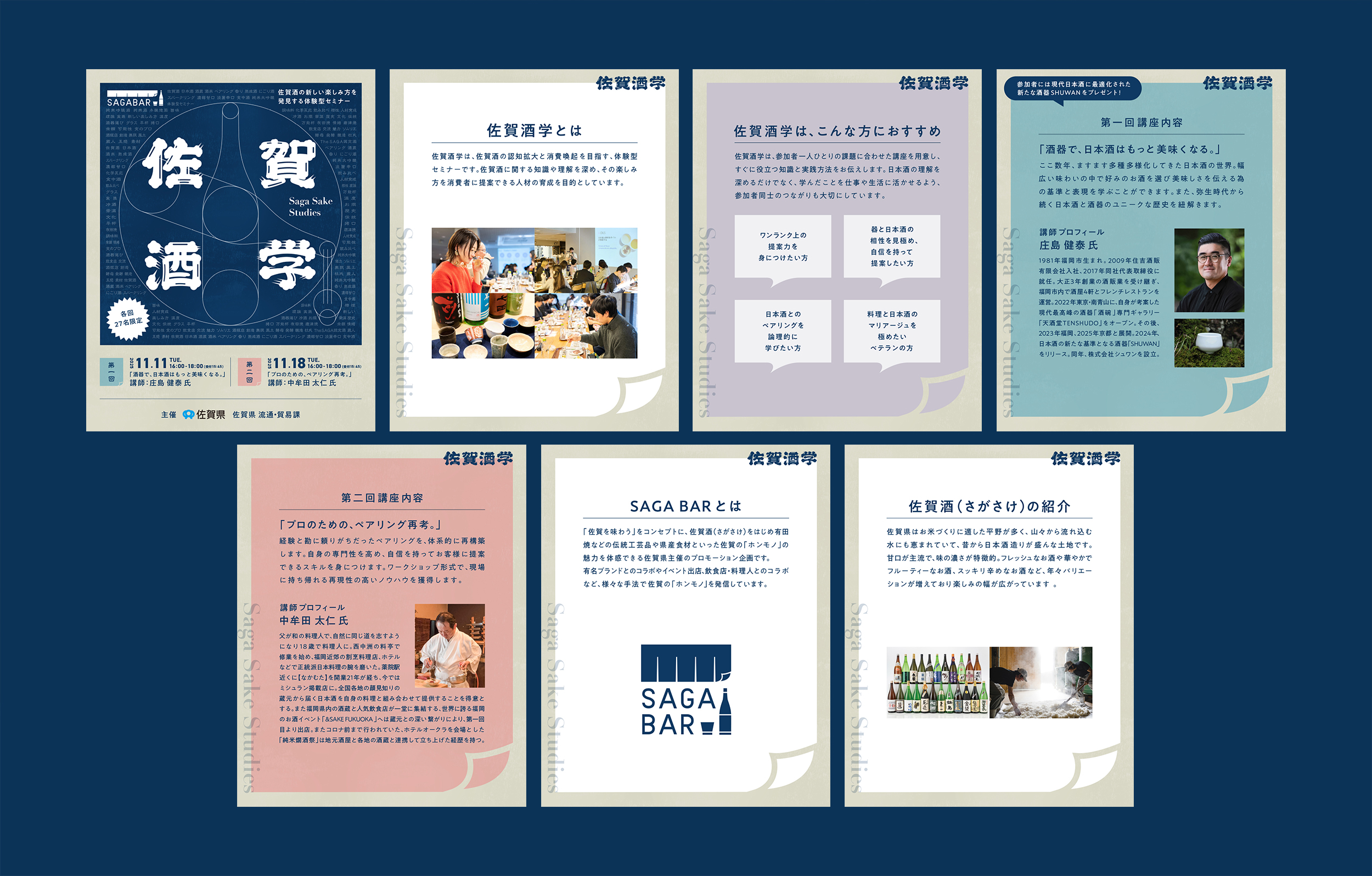
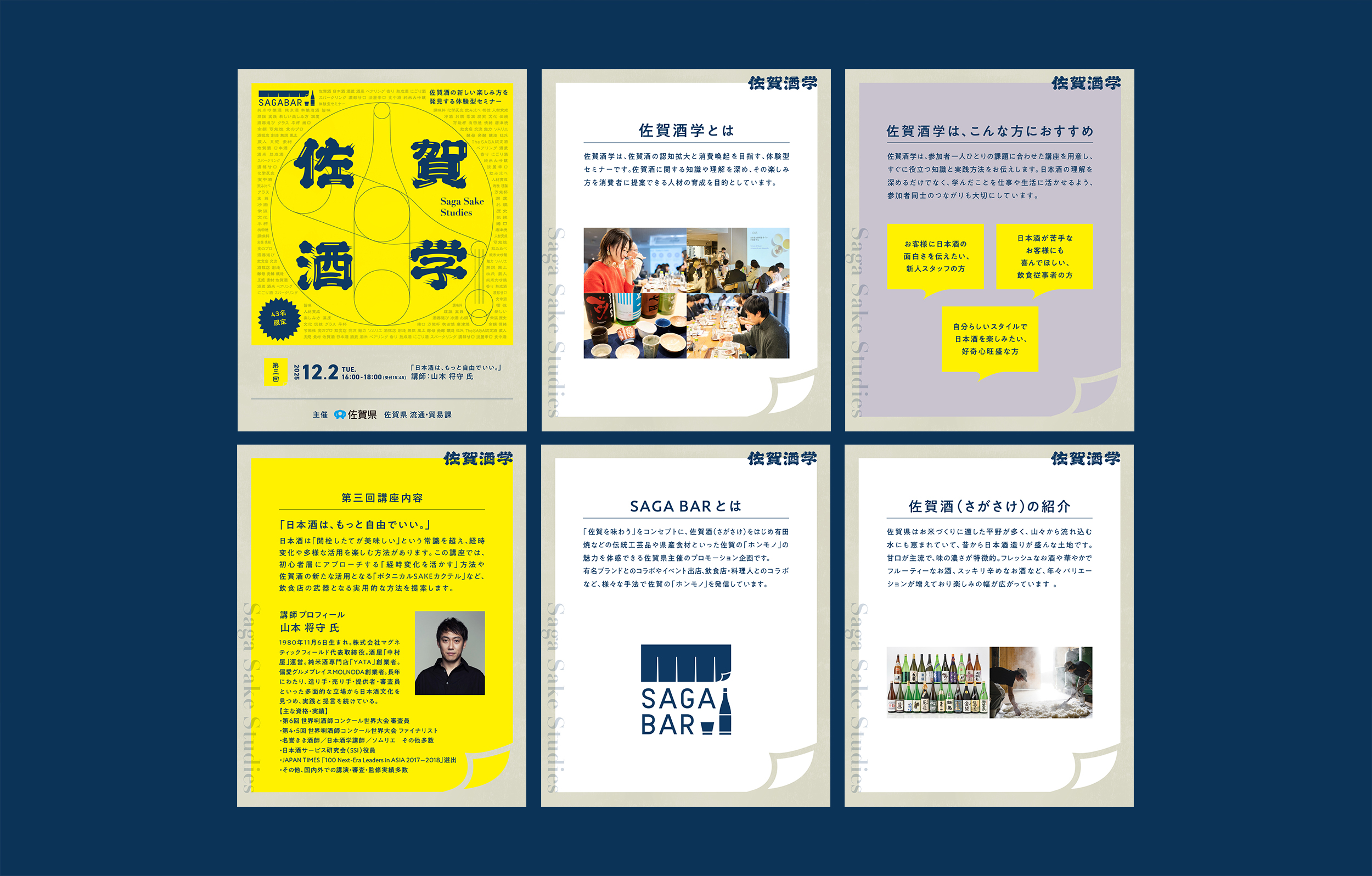
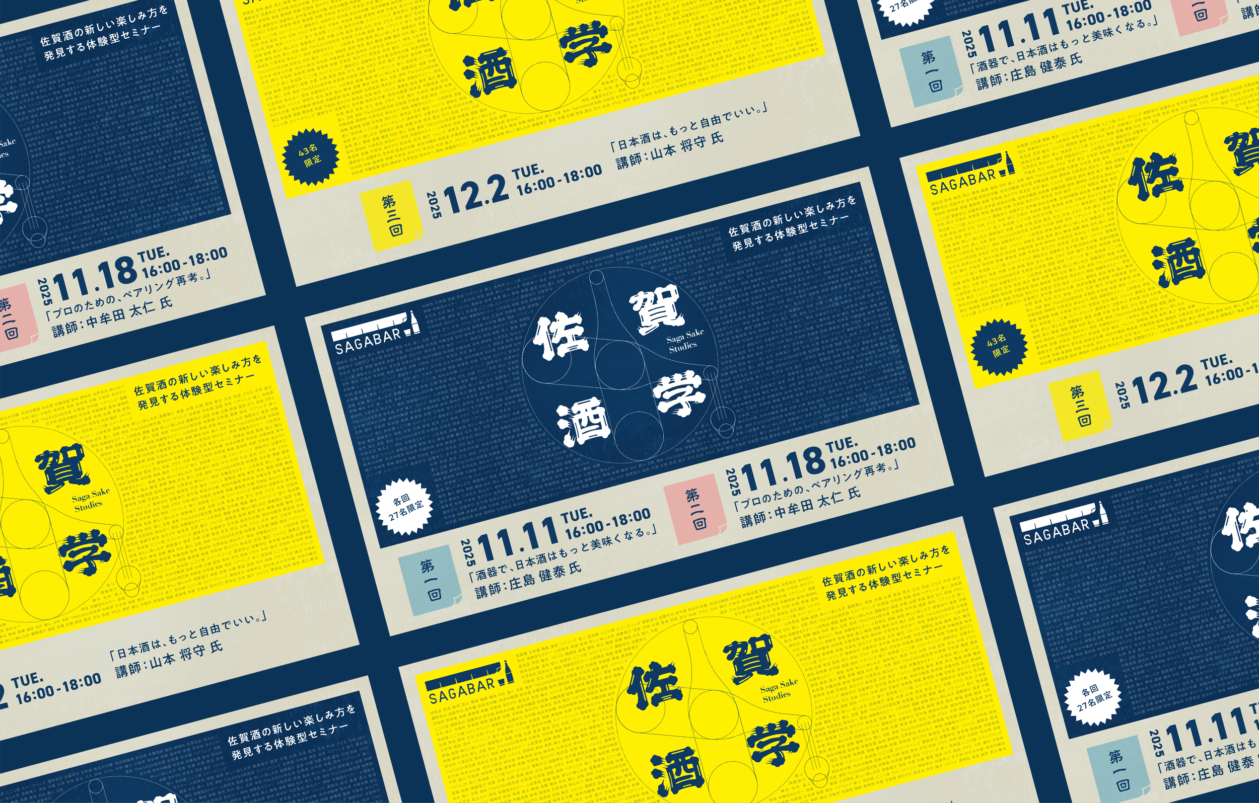
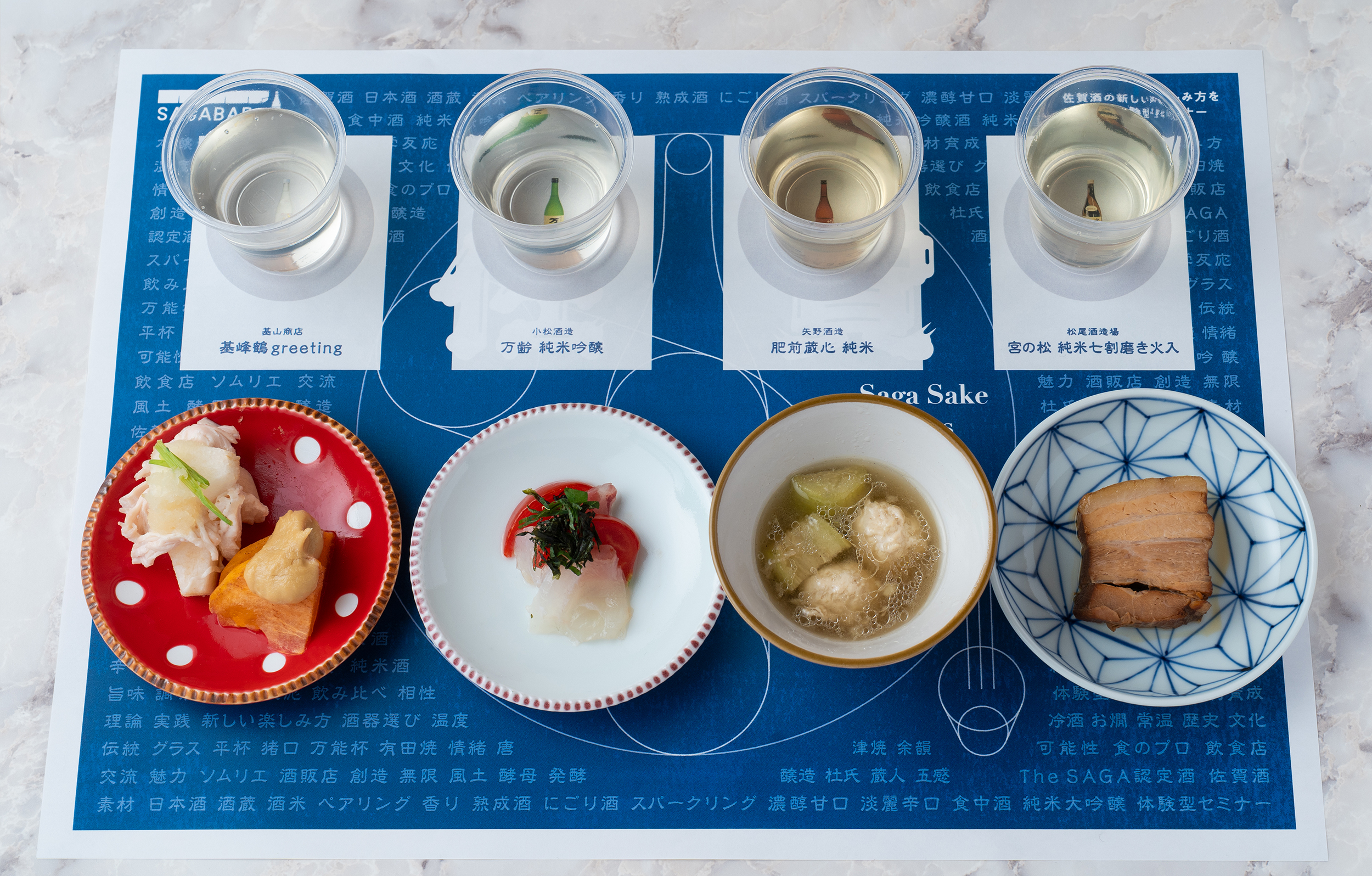
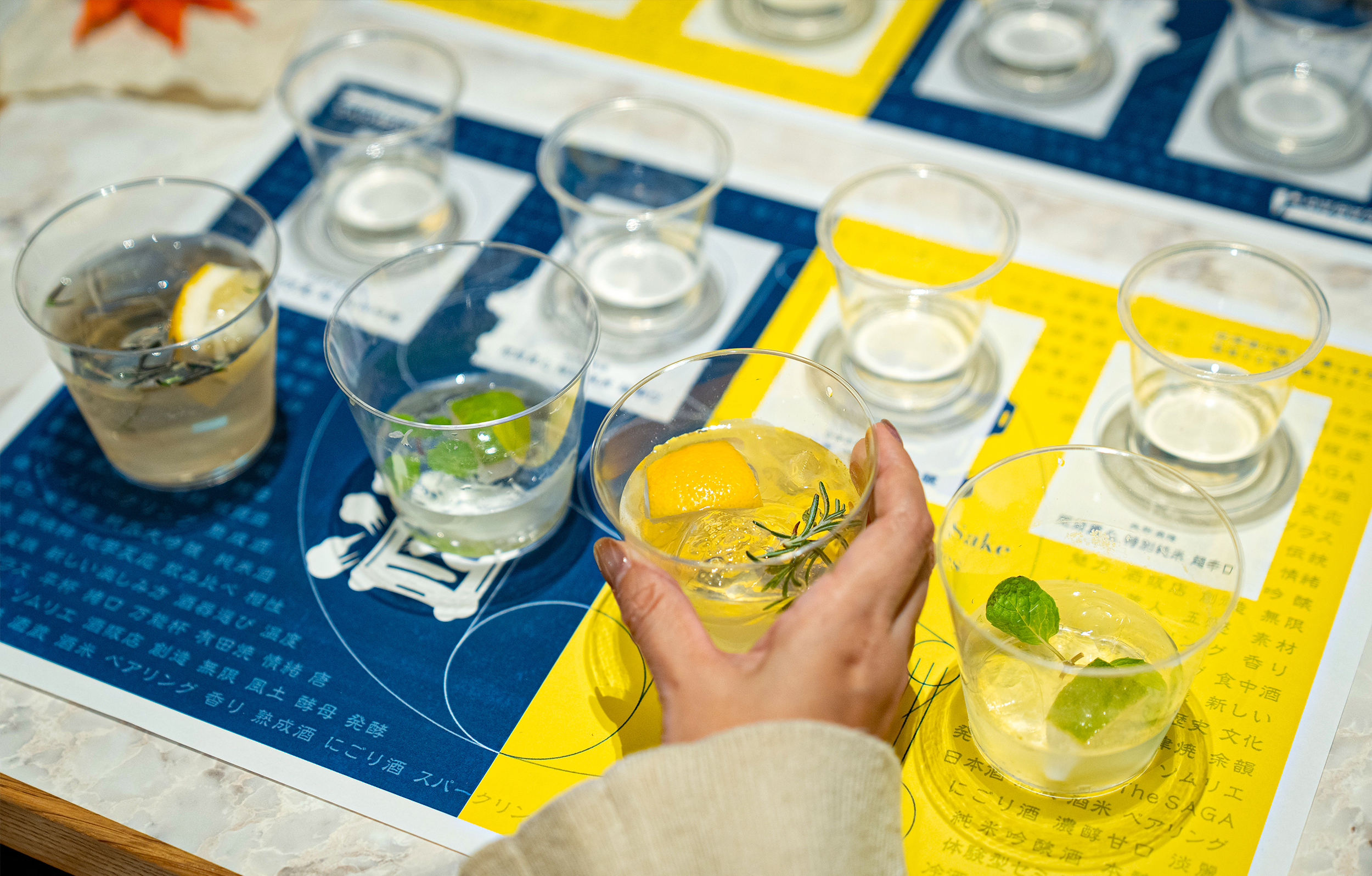
As part of the “SAGA BAR” project promoting Saga sake branding, the experiential seminar “Saga Sake Studies” was held in fiscal year 2024. It serves as a learning platform to deepen knowledge of Saga sake within the diversifying Japanese sake market and cultivate individuals who can pass on its enjoyment to the next generation. In fiscal year 2025, lectures were held in Fukuoka City featuring sake specialists as instructors, covering three distinct themes. This provided an opportunity for everyone from professionals to enthusiasts to learn about the appeal of Saga sake in a deep and multifaceted way.
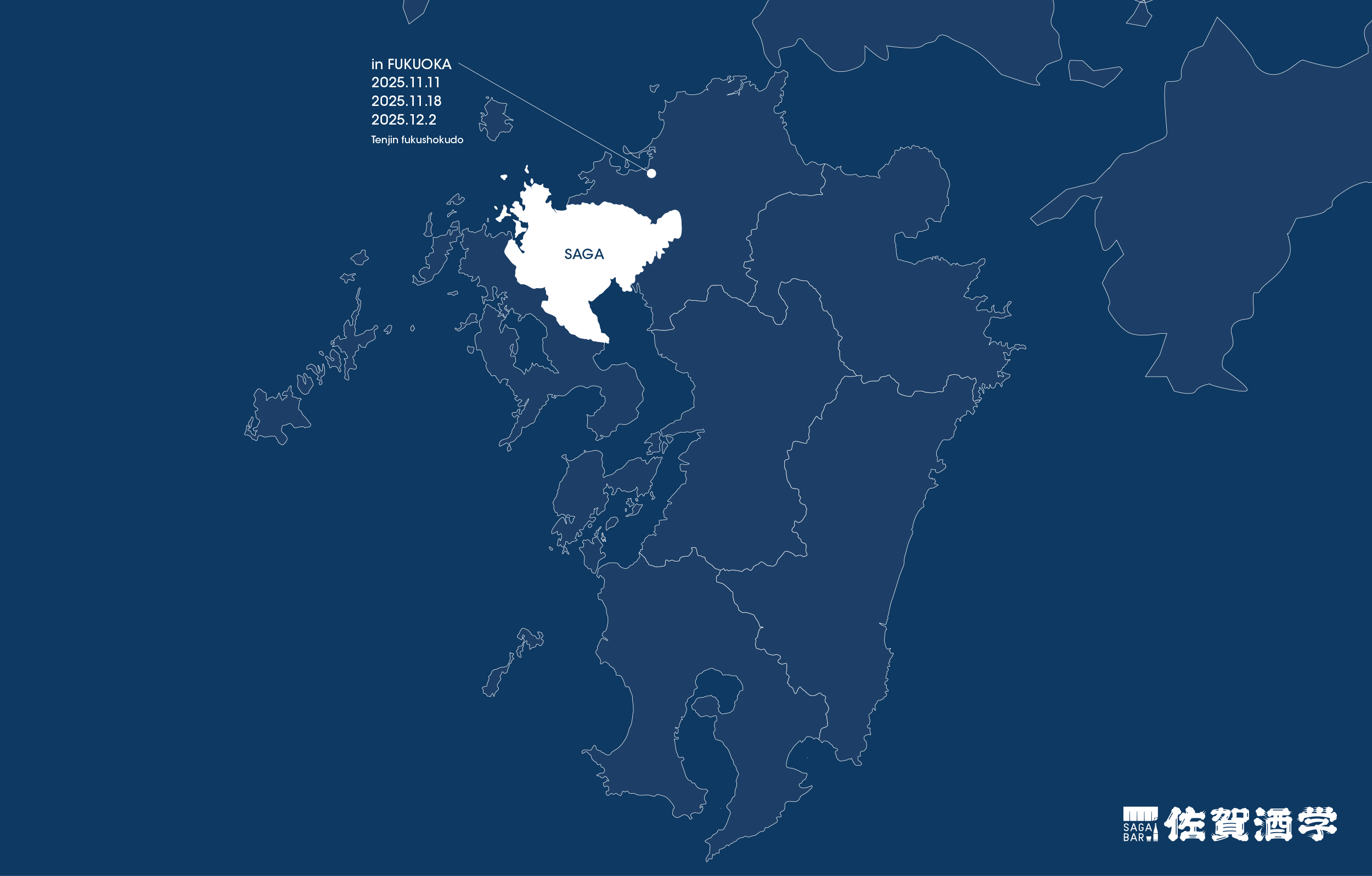
佐賀酒のブランディングを推進する「SAGA BAR」プロジェクトの一環として、2024年度に開催された体験型セミナー「佐賀酒学」。多様化する日本酒市場において、佐賀酒の知識を深め、その楽しみ方を次世代へ繋ぐ人材を育成するための学びの場です。2025年度は福岡市にて、日本酒のスペシャリストを講師に迎え、異なる3つのテーマで講座を実施。プロからファンまでが佐賀酒の魅力を深く、多角的に学ぶ機会が提供されました。
The Academic Pursuit of Saga Sake
アカデミックな佐賀酒の探求
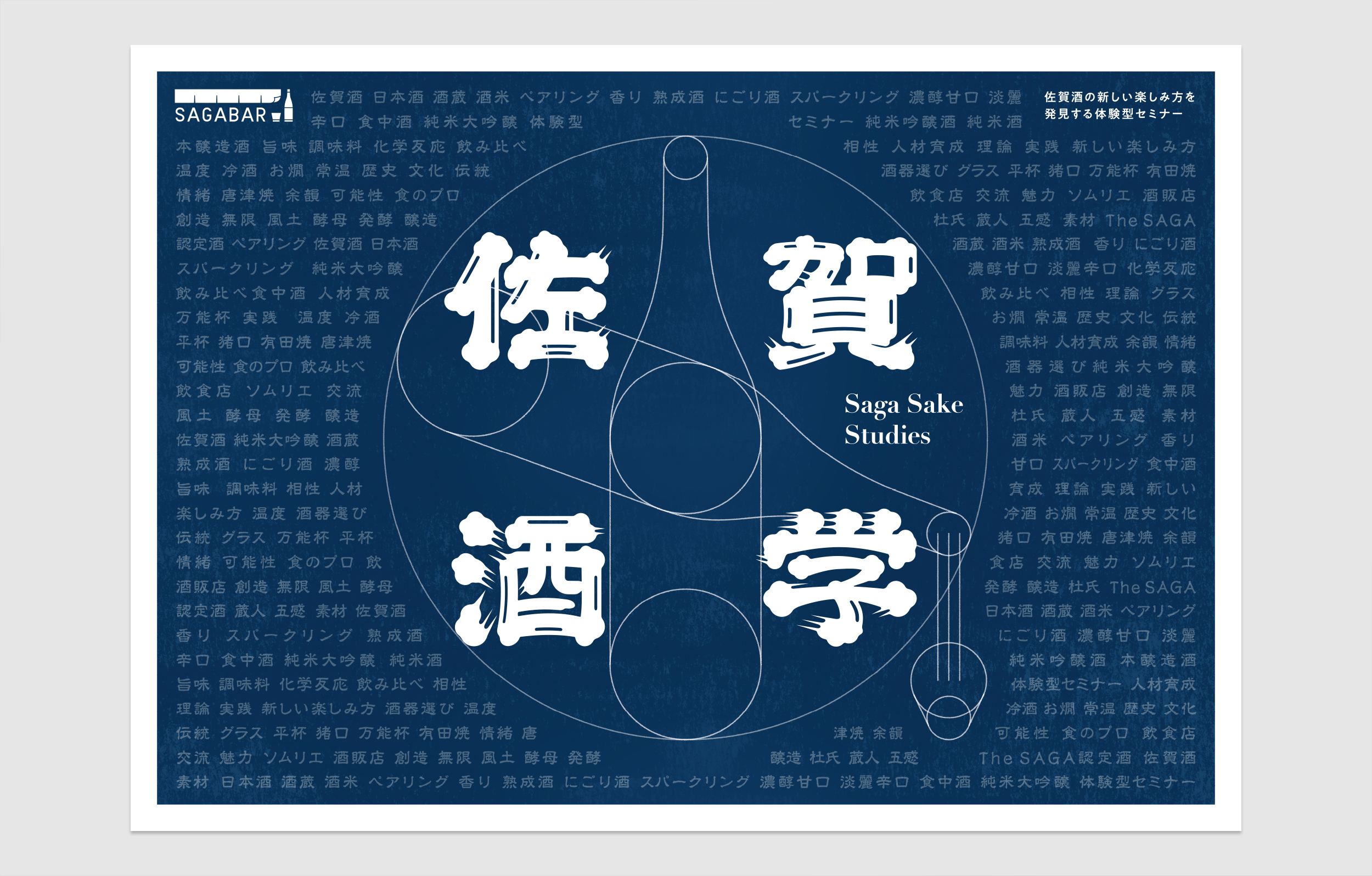
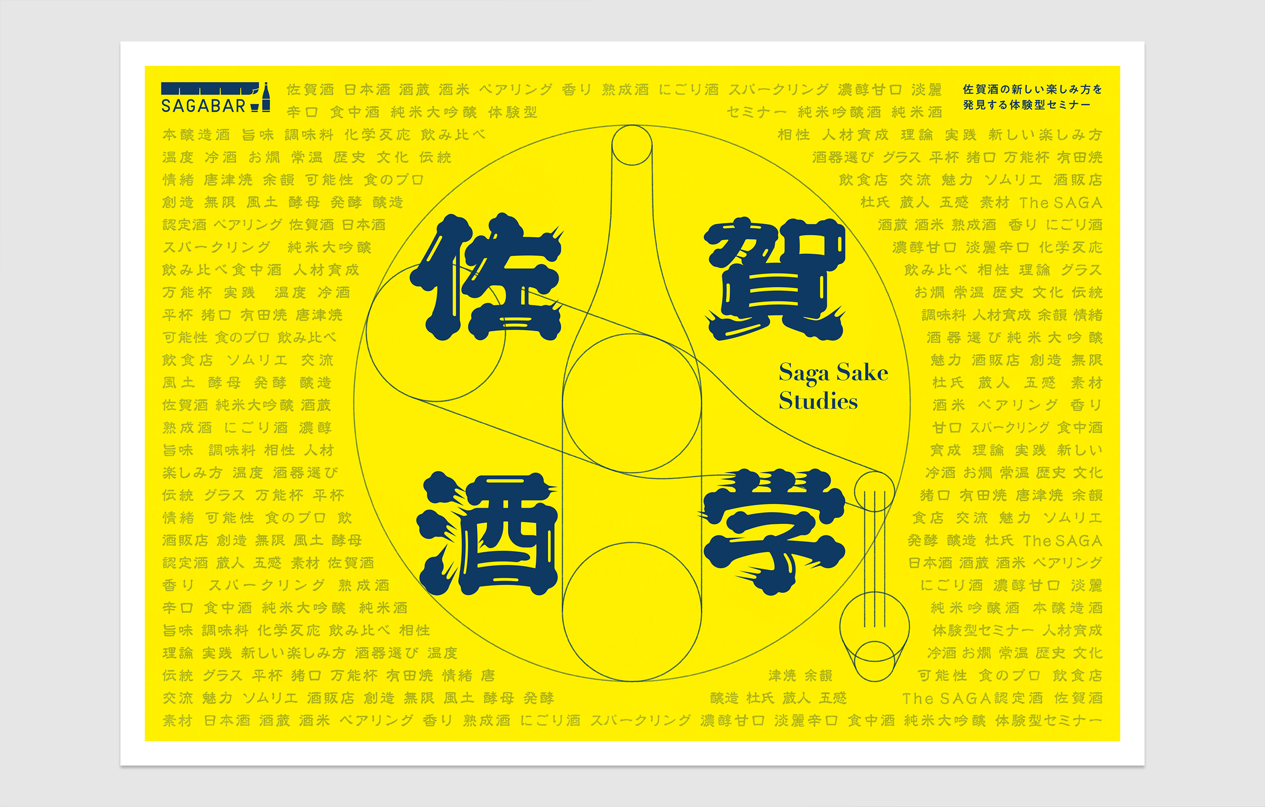
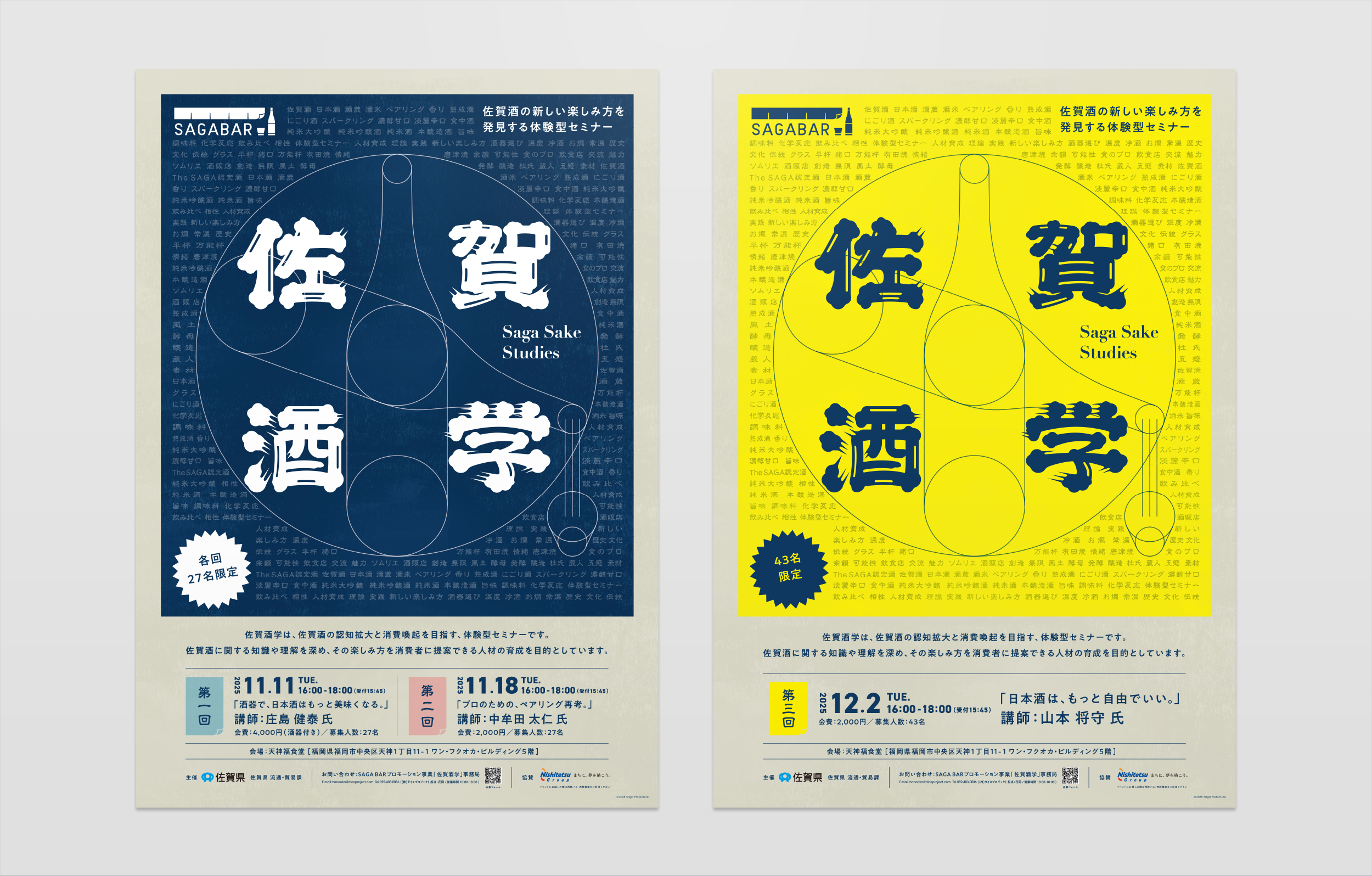
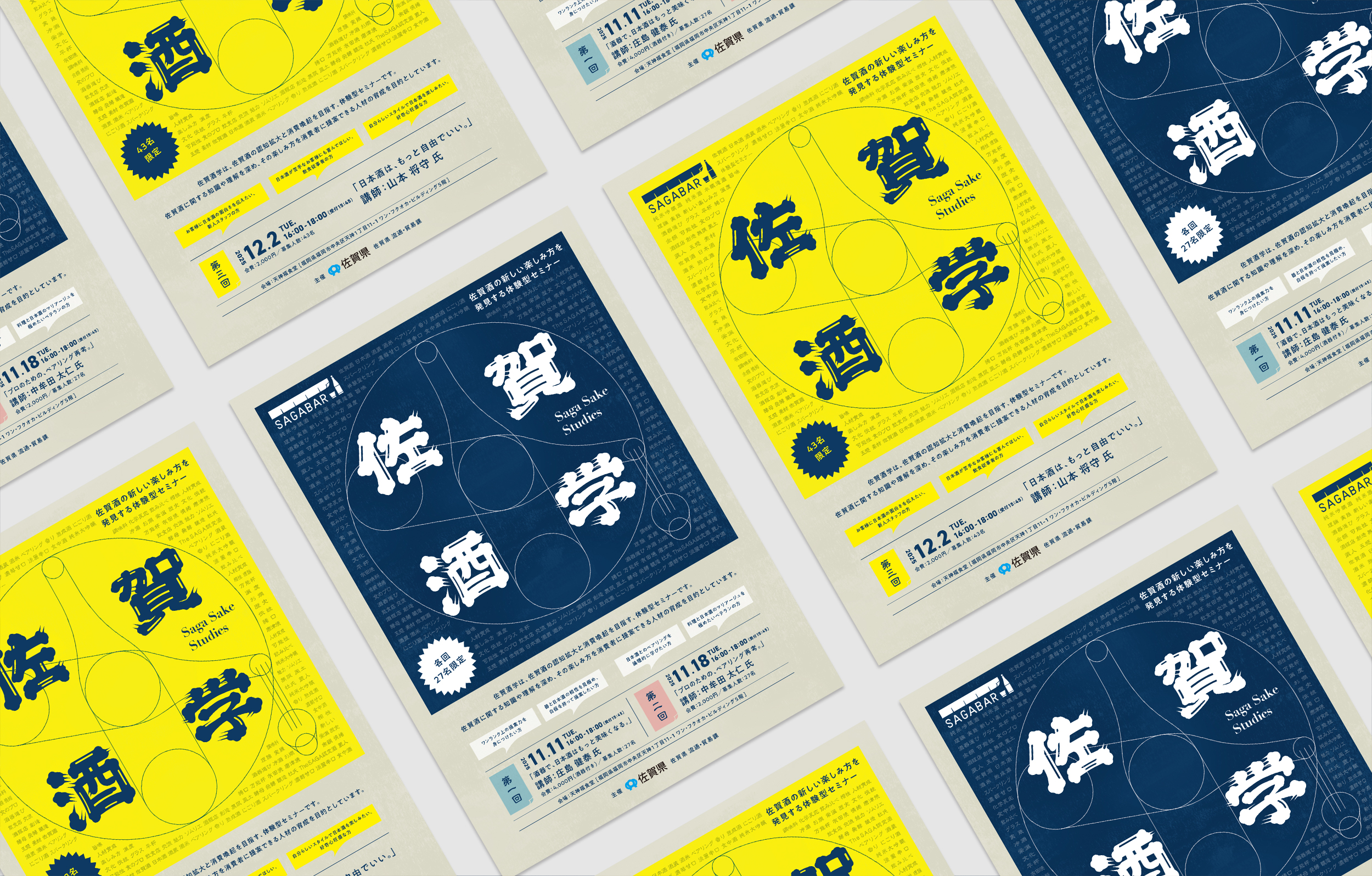
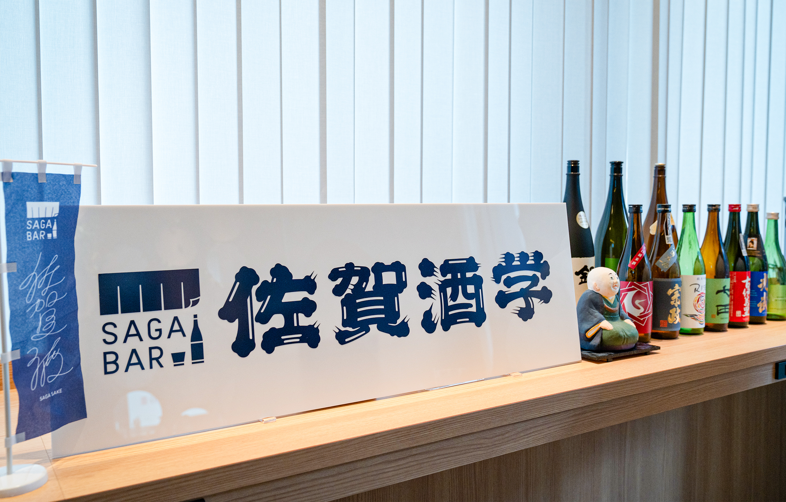
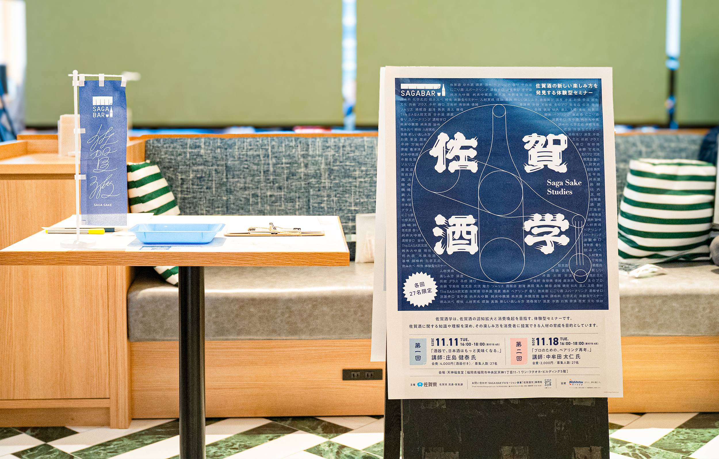
Under the direction of DICE PROJECT, I handled the graphic tools for the experiential seminar “Saga Sake Studies,” including the logotype and key visual. The key visual was inspired by Leonardo da Vinci’s “Vitruvian Man.” Just as this drawing symbolizes scientific inquiry and intellect, “Saga Sake Studies” also represents a place to deeply explore Saga sake and discover new ways to enjoy it. The visual background features meticulously arranged keywords related to the project. The “Saga Sake Studies” logotype was designed from scratch, based on an original “beard-style” font that honors the dignity and tradition of Japanese sake. This created a unique identity where intellectual curiosity and the tradition of Saga sake coexist. After launch, every session received applications exceeding capacity, with the first and second sessions drawing nearly double the capacity. We are delighted that our production contributed to this success.
DICE PROJECTさまのディレクションのもと、体験型セミナー「佐賀酒学」のロゴタイプおよびキービジュアルをはじめとするグラフィックツールを担当しました。キービジュアルには、レオナルド・ダ・ヴィンチの「ウィトルウィウス的人体図」をモチーフにしました。この図が科学的探究や知性の象徴であるように、「佐賀酒学」もまた佐賀酒を深く探求し、新たな楽しみ方を見出す場であることを表現しています。
ビジュアルの背景にはプロジェクトに関連するキーワードを緻密に配し、「佐賀酒学」のロゴタイプには日本酒の品位と伝統を重んじたオリジナルの「ひげ文字」をベースにオリジナルで設計。知的な探究心と佐賀酒の伝統が共存する、独自のアイデンティティを構築しました。
ローンチ後、全ての回で定員を上回るお申し込みがあり特に第一回・第二回では定員の倍近い応募になったようで、その一助になる制作ができたことを嬉しく思います。


Credit /
Client: SAGA PREFECTURAL GOVERNMENT
Production: DICE PROJECT
Direction: Ami Hanaoka (DICE PROJECT)
Art Direction & Design: Daisuke Kobayashi (SUKEDACHI DESIGN)
204-3-21-4, NOMA, MINAMI-Ku,
FUKUOKA-City, Fukuoka, 815-0041, JAPAN