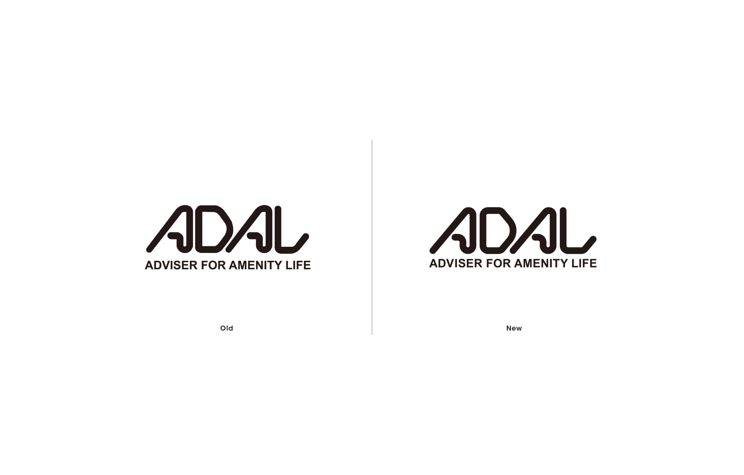
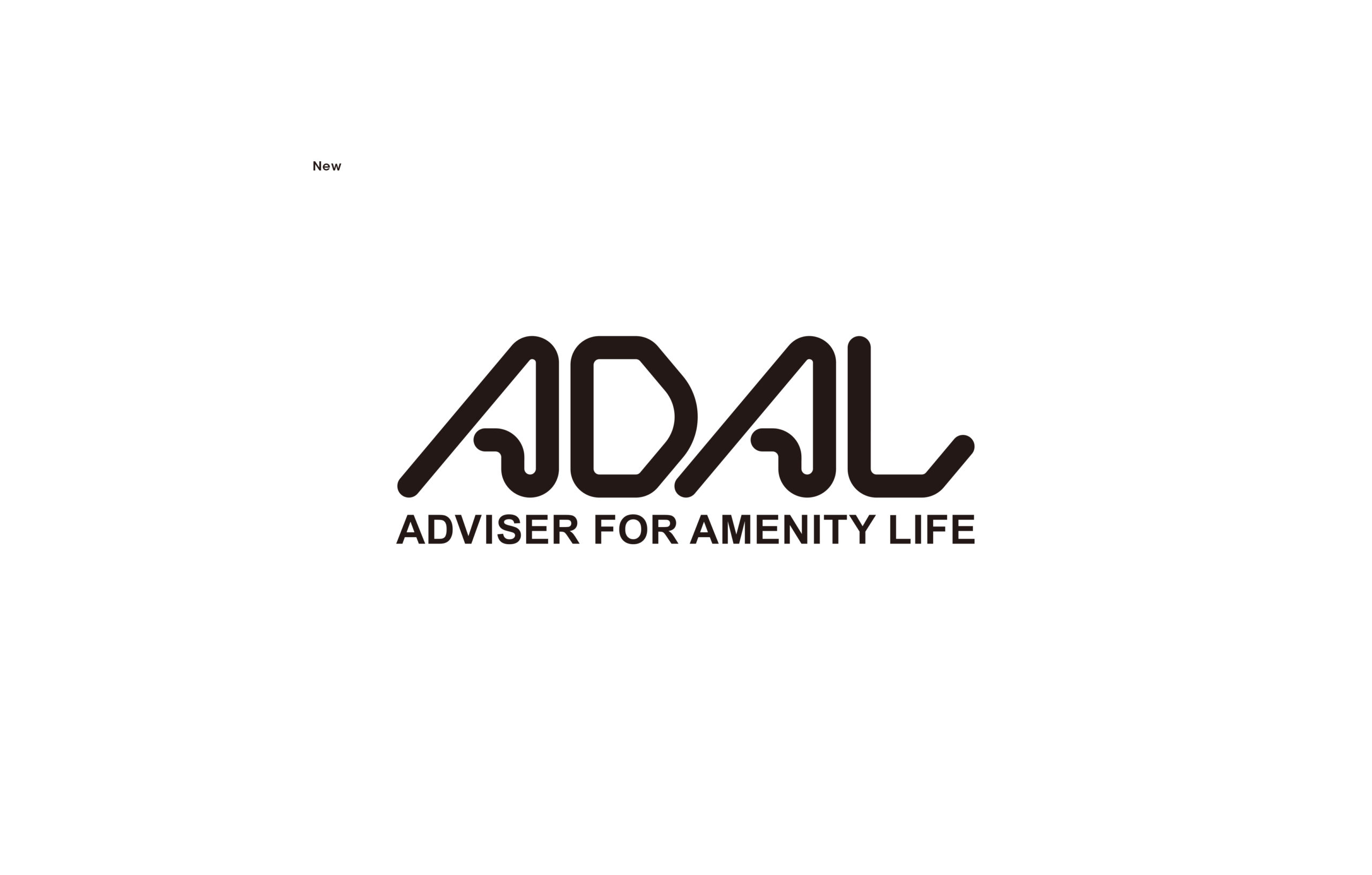
To a beautifully proportioned and durable logo.
綺麗な比率に整え、耐久性の高いロゴへ
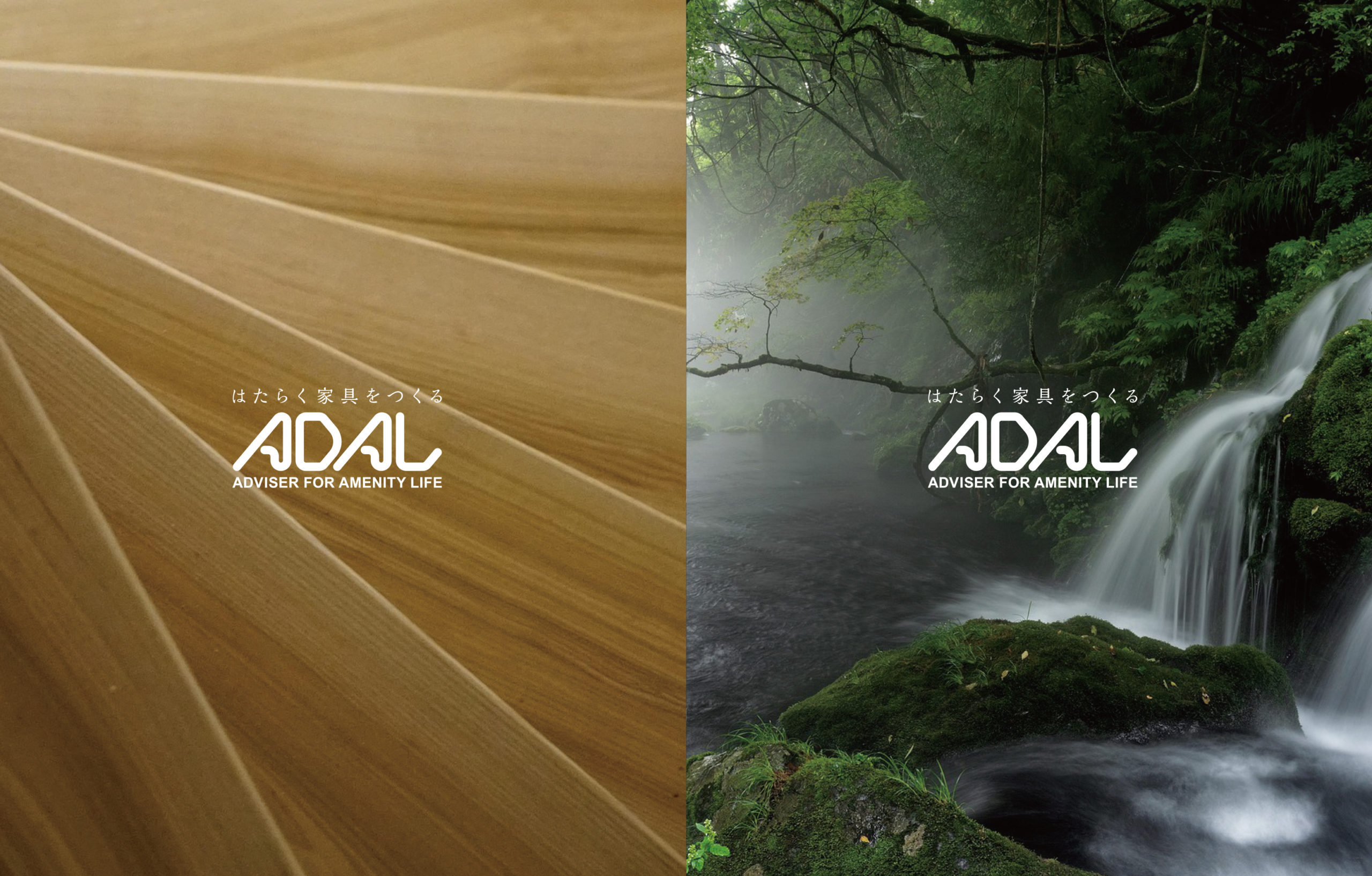
ADAL is a manufacturer of commercial furniture for a wide range of public spaces, including cafes, restaurants, hotels, and hospitals. In 2024, the company won an iF DESIGN AWARD, expanding its presence on the global stage.
While its corporate identity, established in 1983, has adapted to the digital age, challenges such as inconsistent logo usage and the circulation of outdated logo data had emerged. To unify the brand image, we collaborated with Mr. Sato of Bunmyaku Henshushitsu (Context Editing Office) to redesign the ADAL logo and develop new usage guidelines.
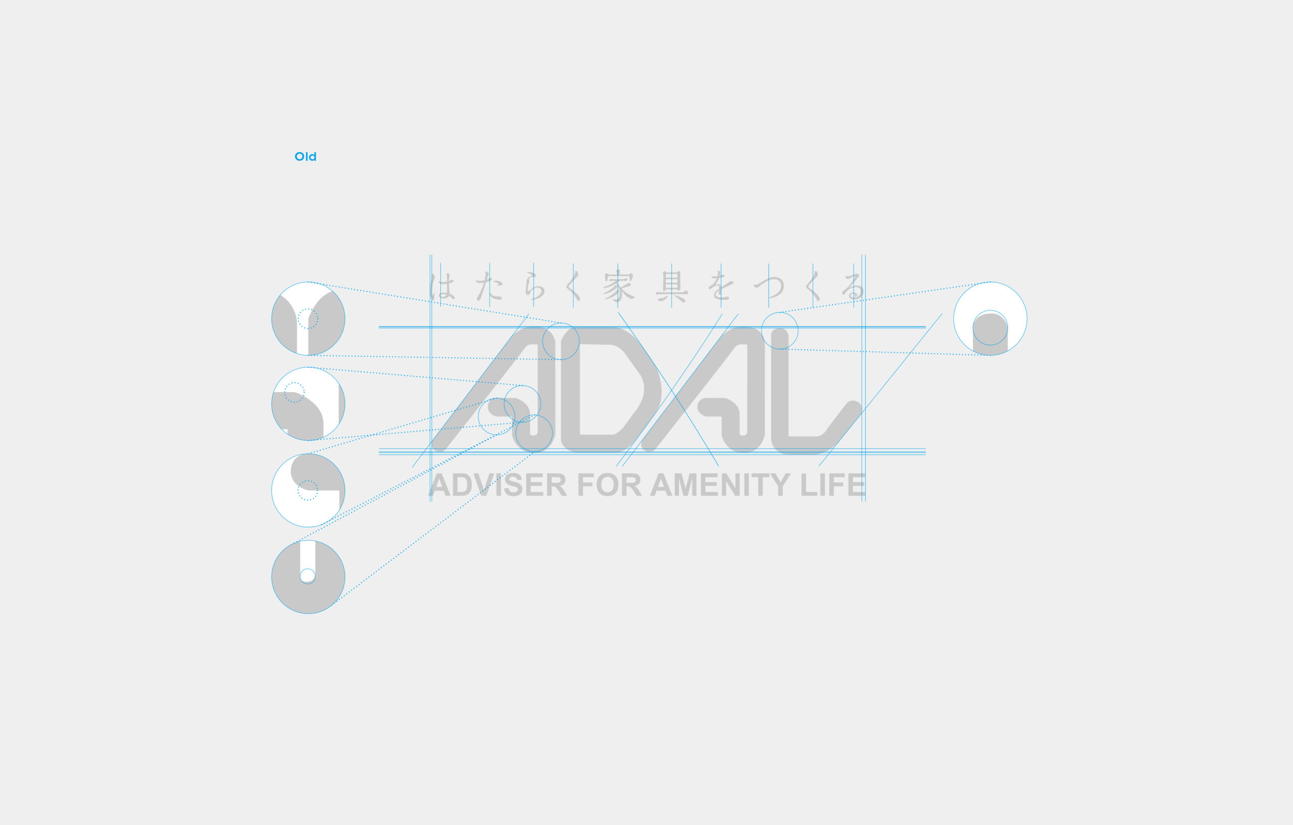
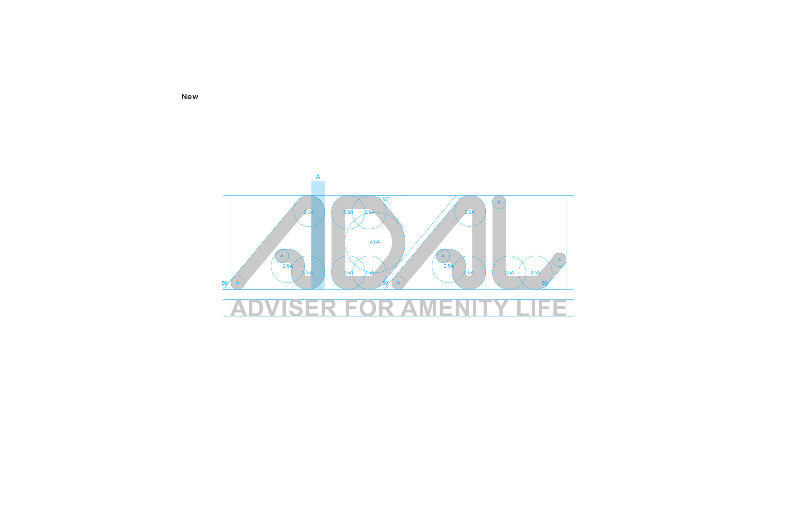
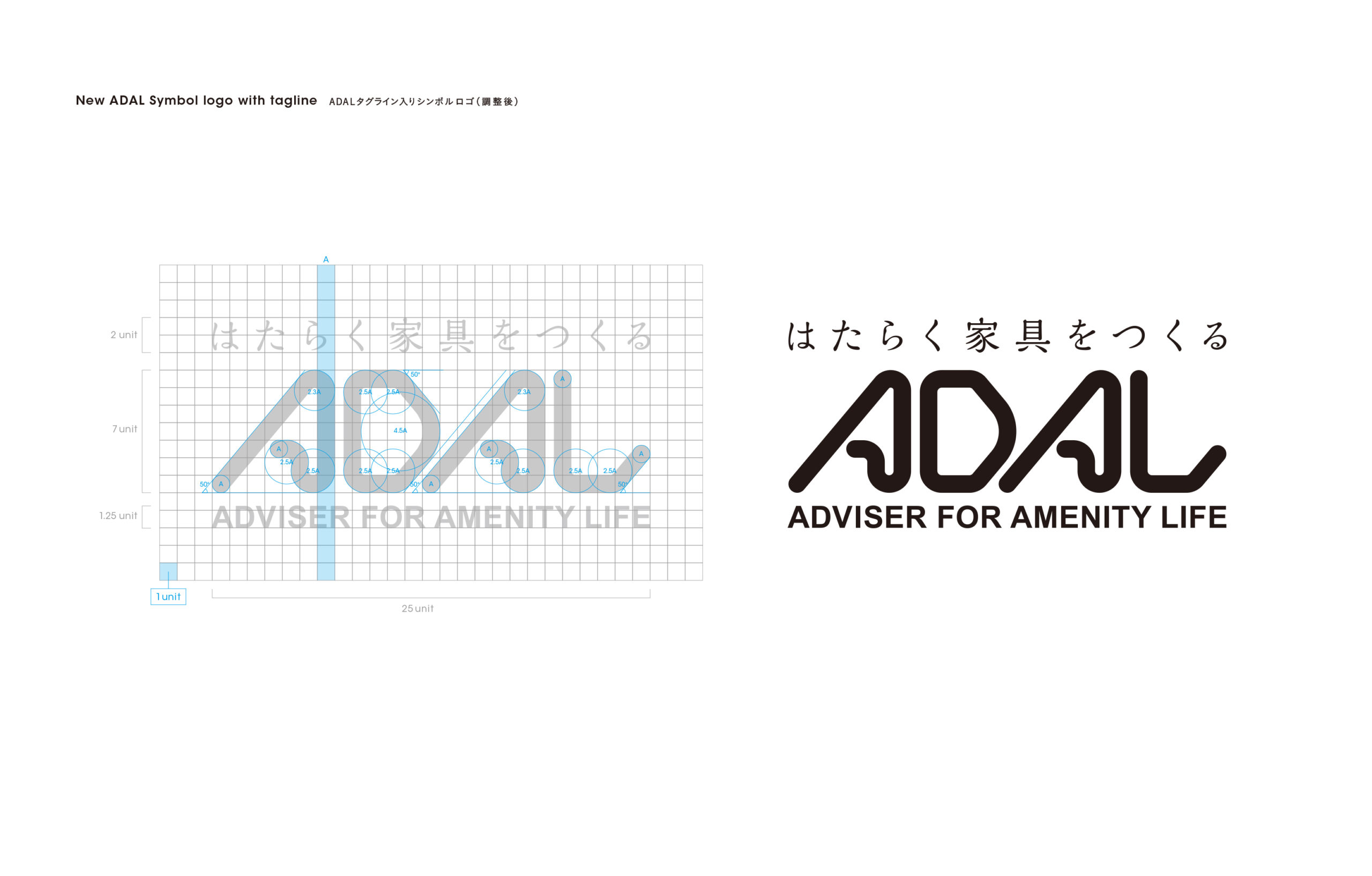
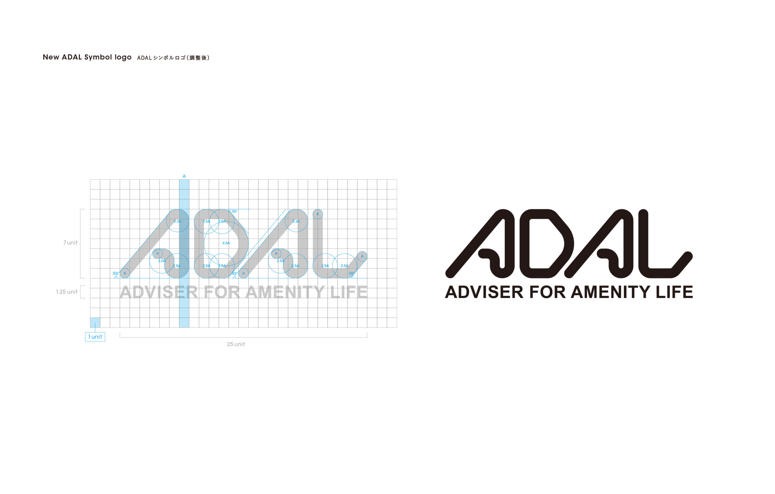
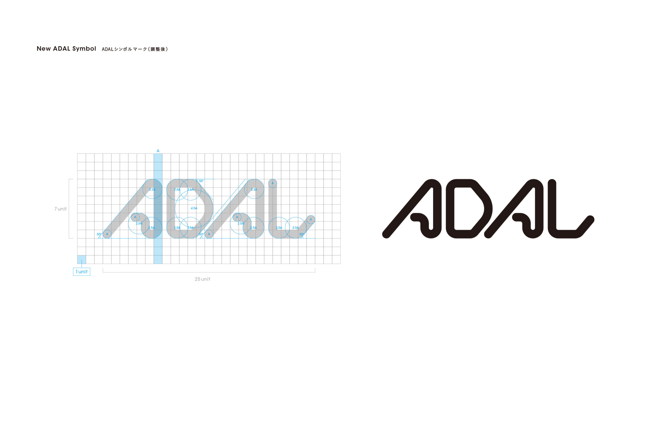
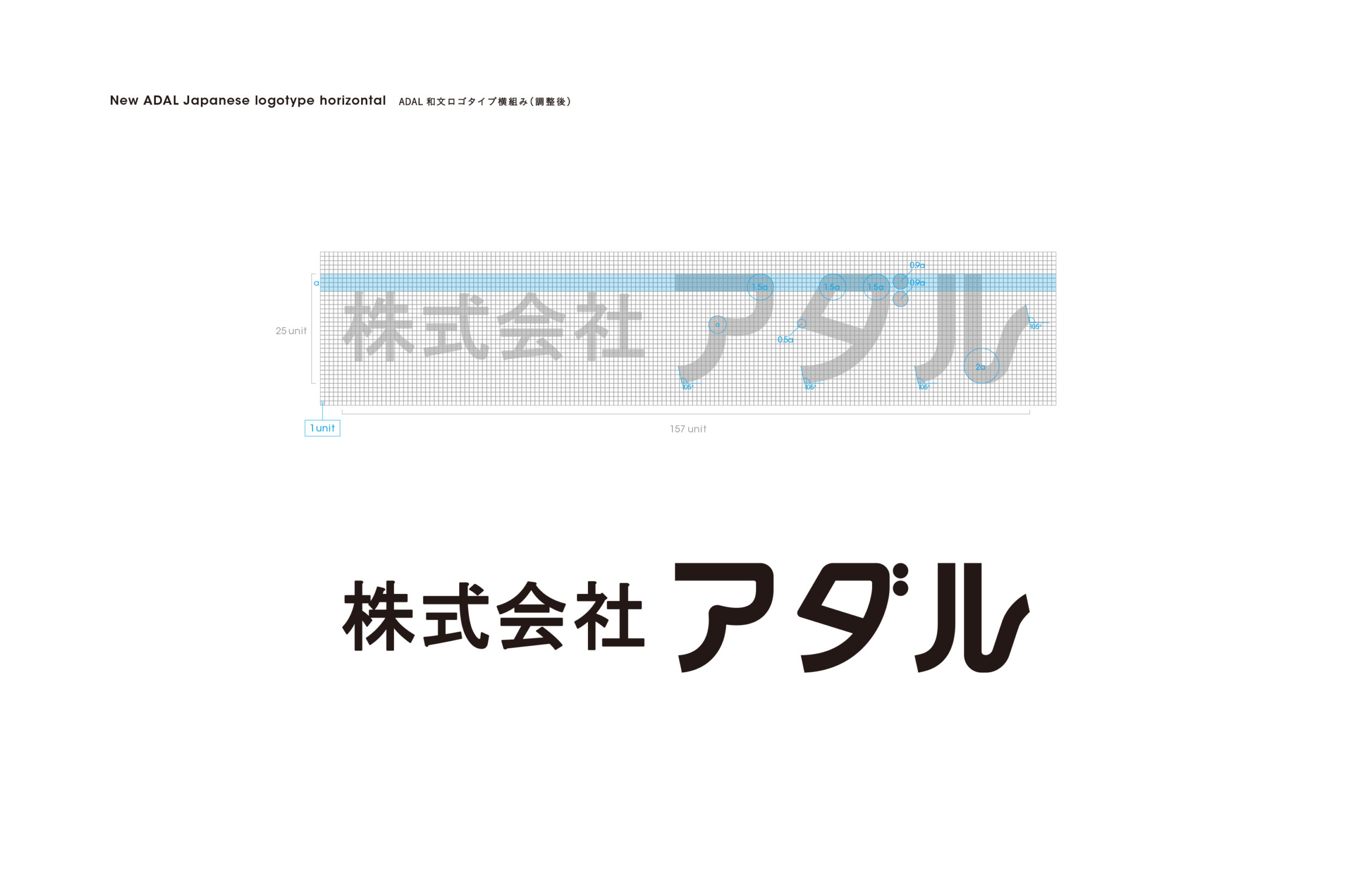
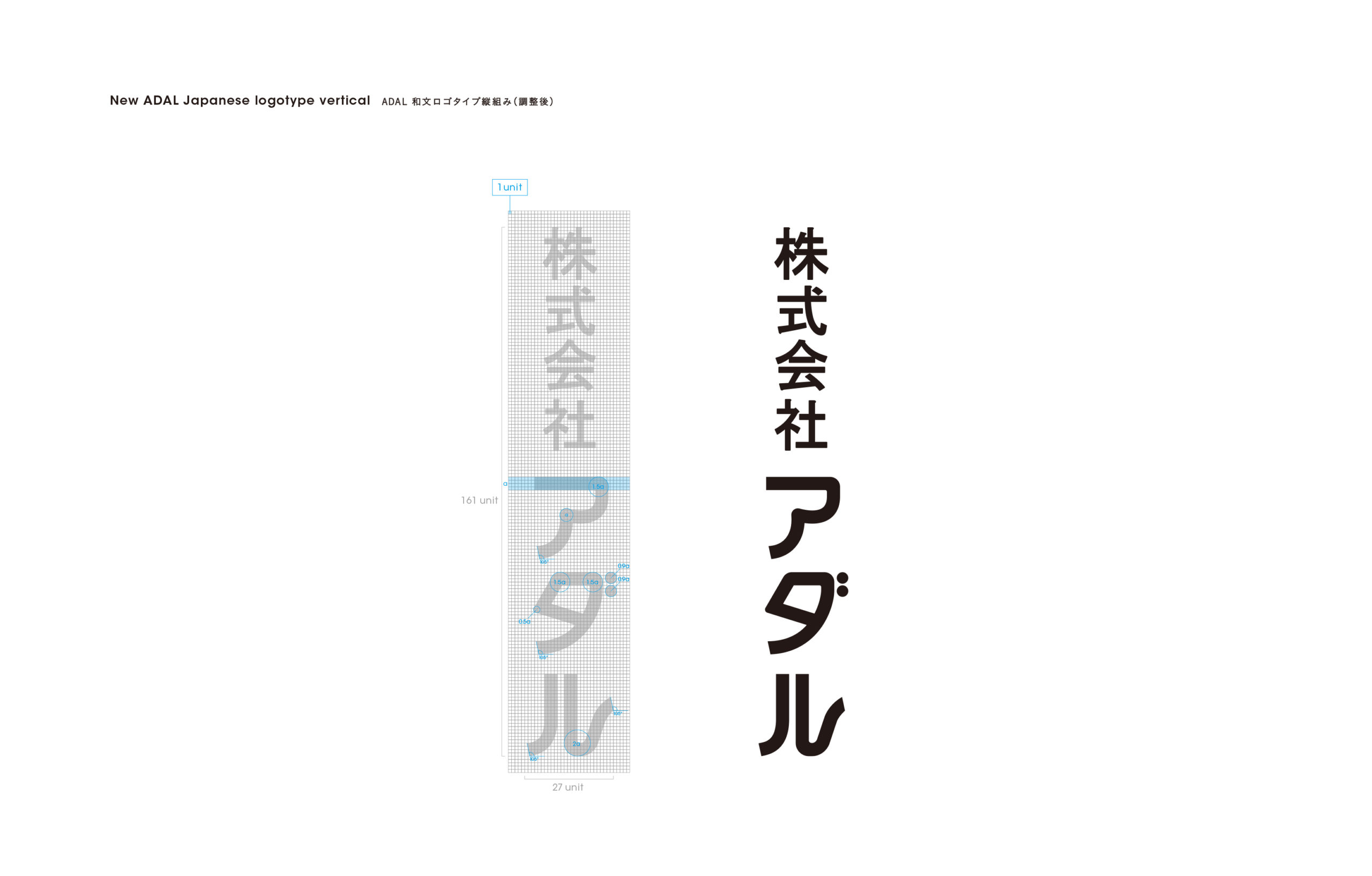
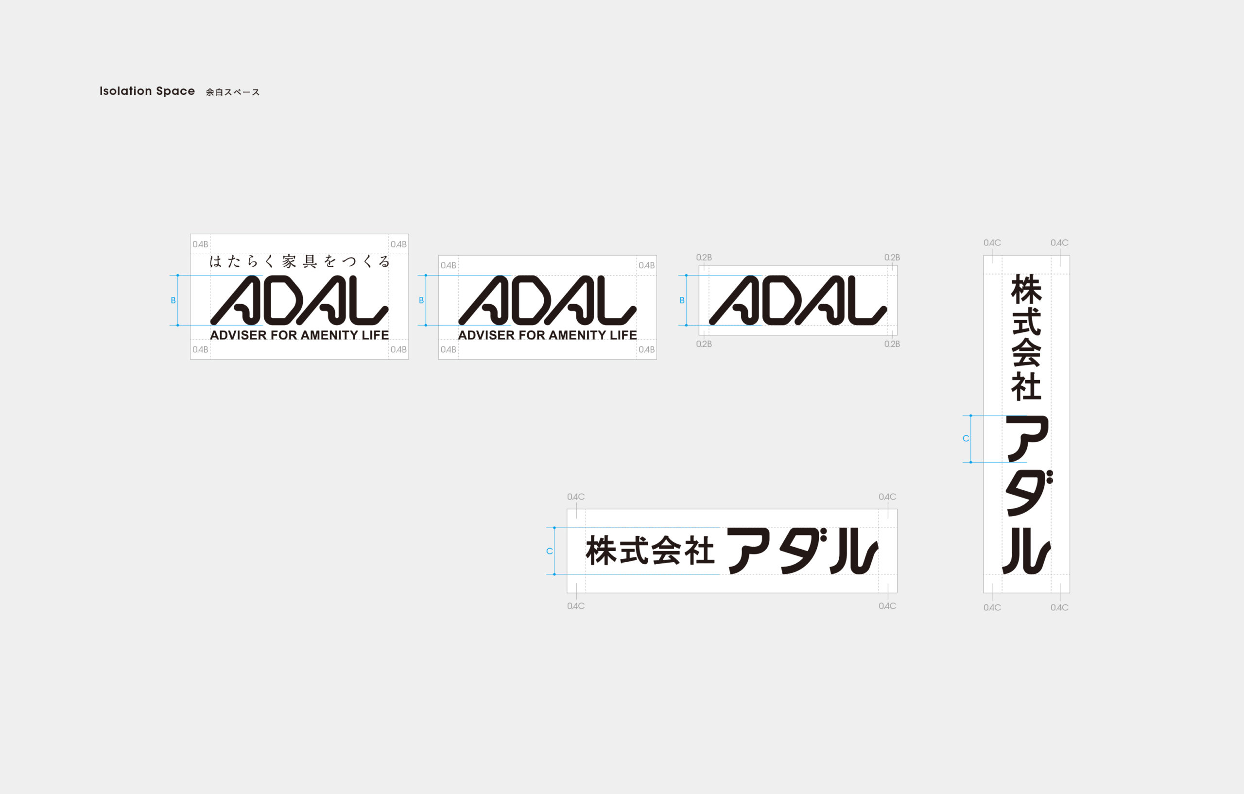
One of our key roles was to uncover the inherent principles of beauty within the existing logo and refine it to achieve perfect proportions. We began by meticulously analyzing every component, from its individual letters to its lines. We adjusted the spacing, line weight, and overall balance, carefully redesigning the logo’s proportions to preserve its original impression. Our goal was to create a “durable logo” that would maintain its beauty and legibility across all media—from a smartphone screen to a large-scale billboard.
Following the redesign, we received positive feedback from the ADAL team, with members sharing that they now “feel more confident in the logo.” We hope that this evolving logo will continue to shine as a timeless identity for ADAL long into the future.
カフェやレストラン、ホテル、病院など、多様な公共空間に向けた業務用家具の製造・販売を手がけるADAL様。2024年には「iF DESIGN AWARD」を受賞するなど、その存在感は海外にも広がっています。
1983年に制定されたCI(コーポレート・アイデンティティ)は、時代と共にデジタル領域での活用が広がる一方、意図しない形でロゴが使用されるケースや、過去のロゴデータが混在するといった課題が浮上していました。ブランドイメージの統一を図るため、文脈編集室の佐藤様とともにADALロゴのリデザインと使用ガイドラインの制作に携わることになりました。
私たちの役割の一つは、既存ロゴに内在する美の法則を見つけ出し、それを綺麗な比率に磨き上げることでした。まず、ロゴを構成する文字や線のひとつひとつを徹底的に分析。文字間の余白、線の太さ、全体のバランスを調整し、既存の印象を損なわないよう注意を払いながら、ロゴのプロポーションを再設計し、スマートフォン画面から巨大な看板まで、あらゆる媒体で美しさと視認性を損なわない「耐久性の高いロゴ」を目指しました。
このリデザインを通じて、ADALの皆様から「ロゴに自信が持てるようになった」とのお言葉をいただきました。これからも進化していくADALのロゴマークがこの先の未来へ輝き続けるアイデンティティになれば幸いです。

Credit /
Client: ADAL CO., LTD.
Design Firm: BUNMYAKU HENSHUSHITSU
Creative Direction: Hitomi Sato (BUNMYAKU HENSHUSHITSU)
Art Direction & Design: Daisuke Kobayashi (SUKEDACHI DESIGN)
204-3-21-4, NOMA, MINAMI-Ku,
FUKUOKA-City, Fukuoka, 815-0041, JAPAN