
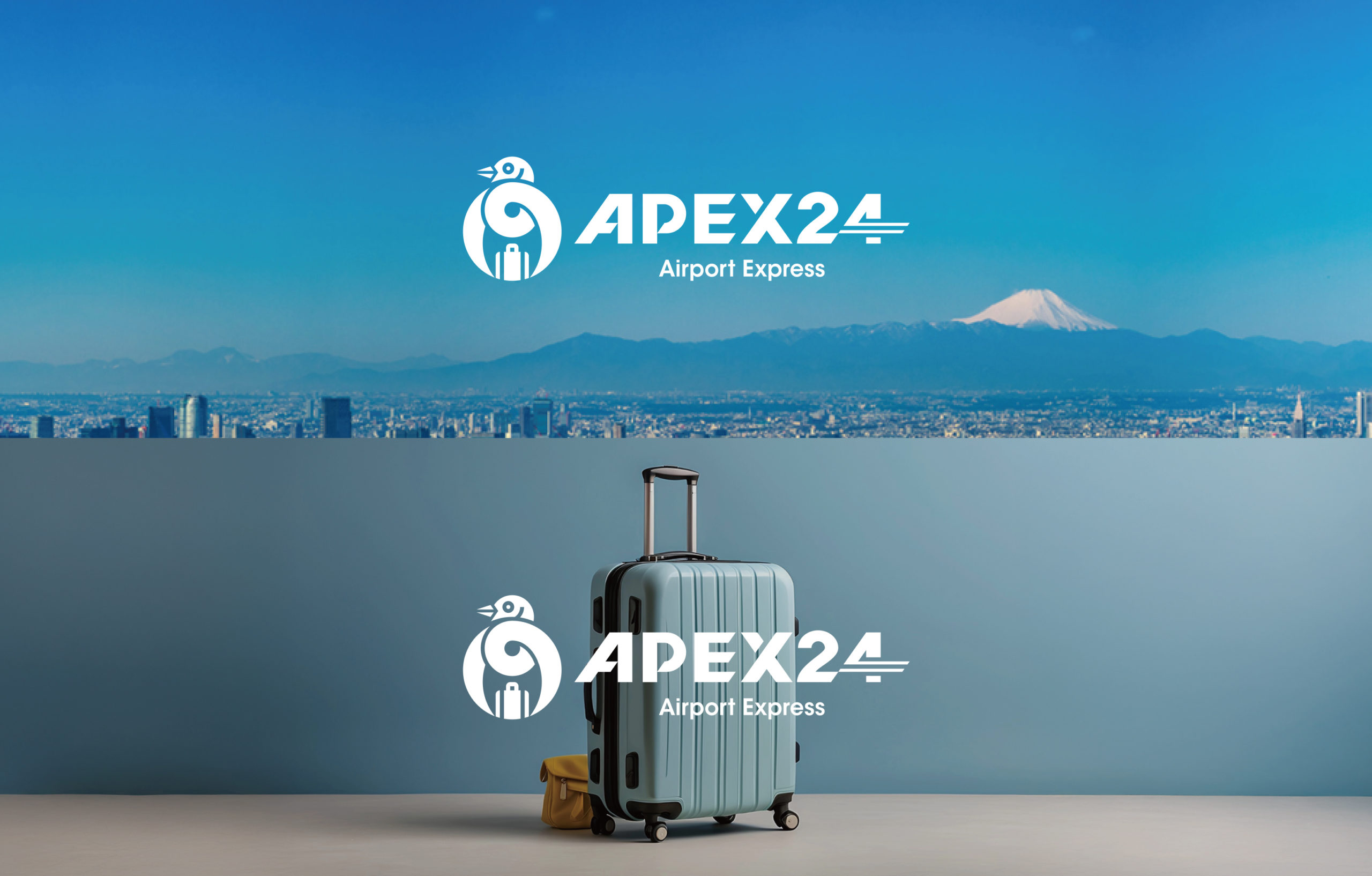
Symbol mark featuring a bird bringing happiness
幸せを運ぶ鳥をモチーフにしたシンボルマーク
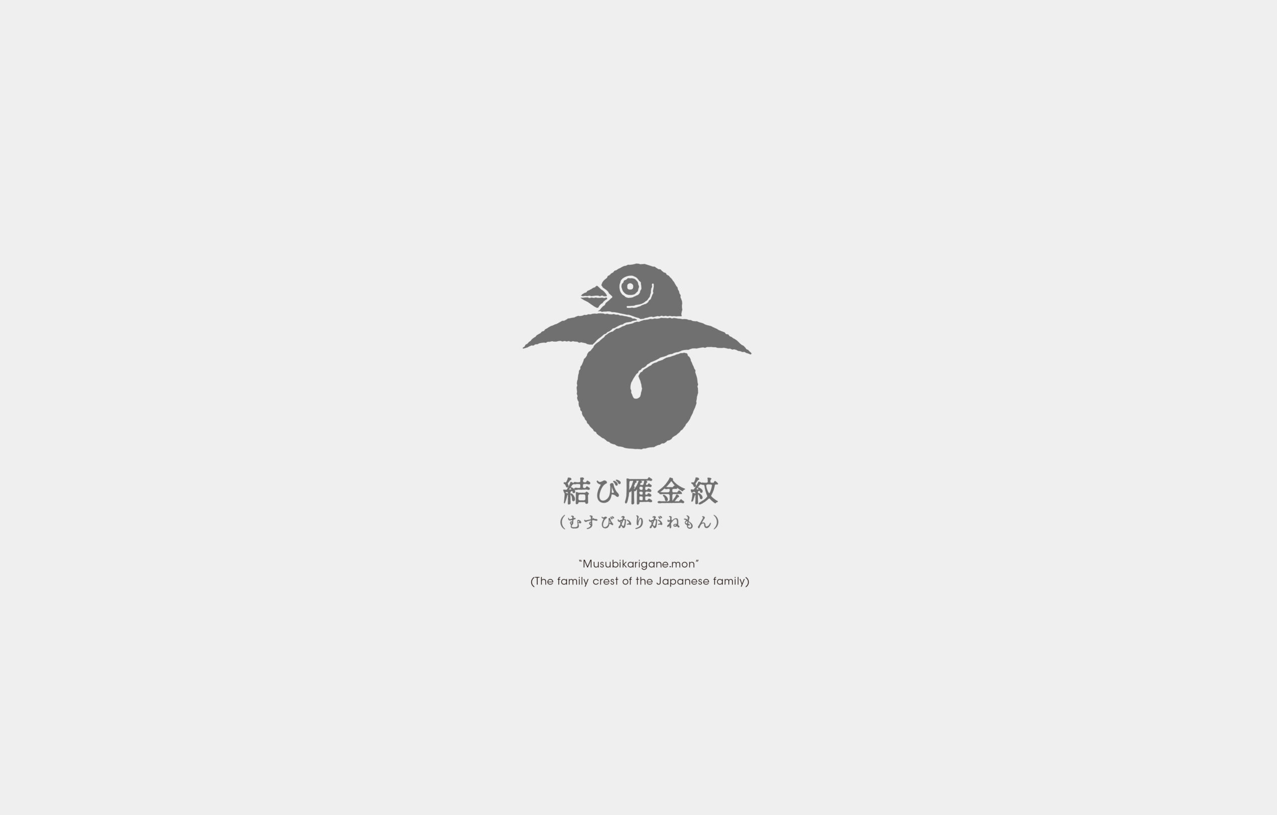
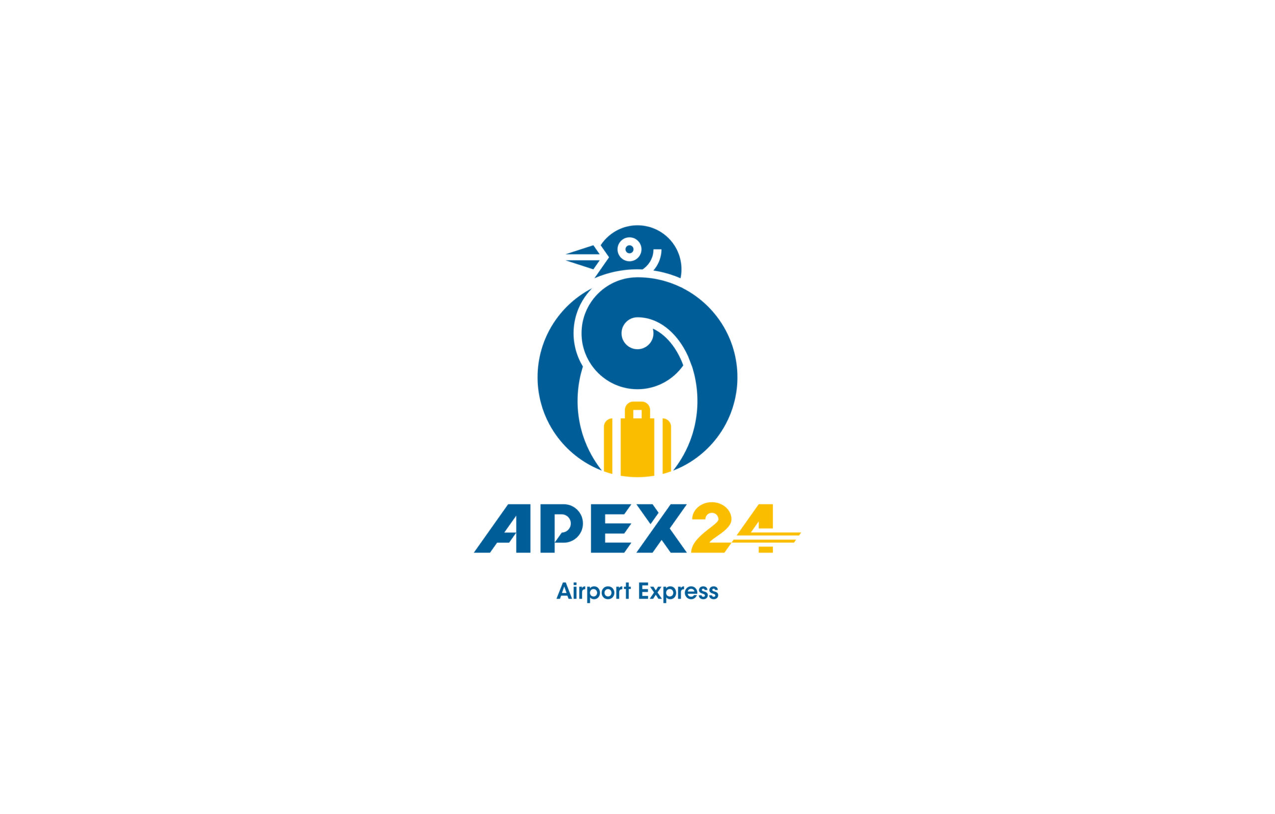
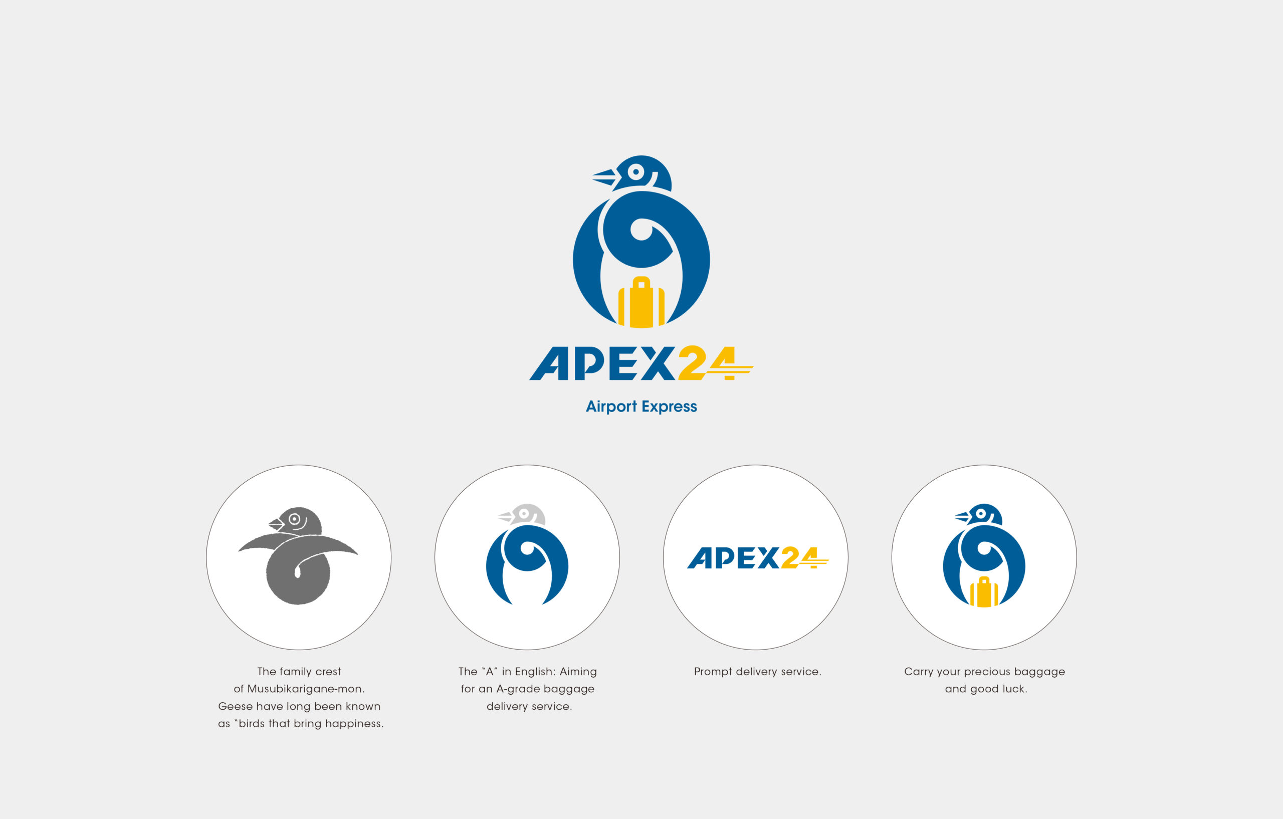
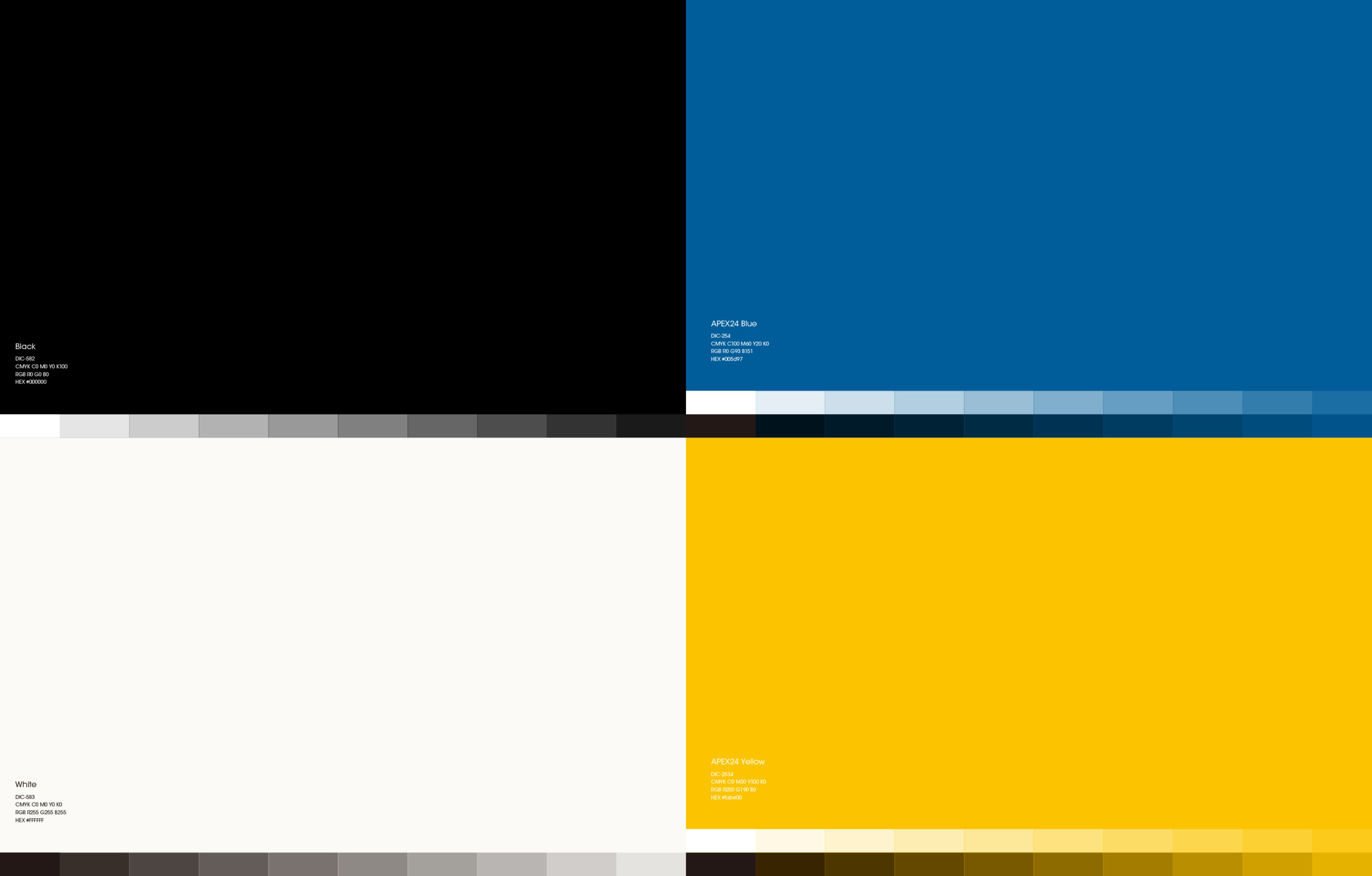
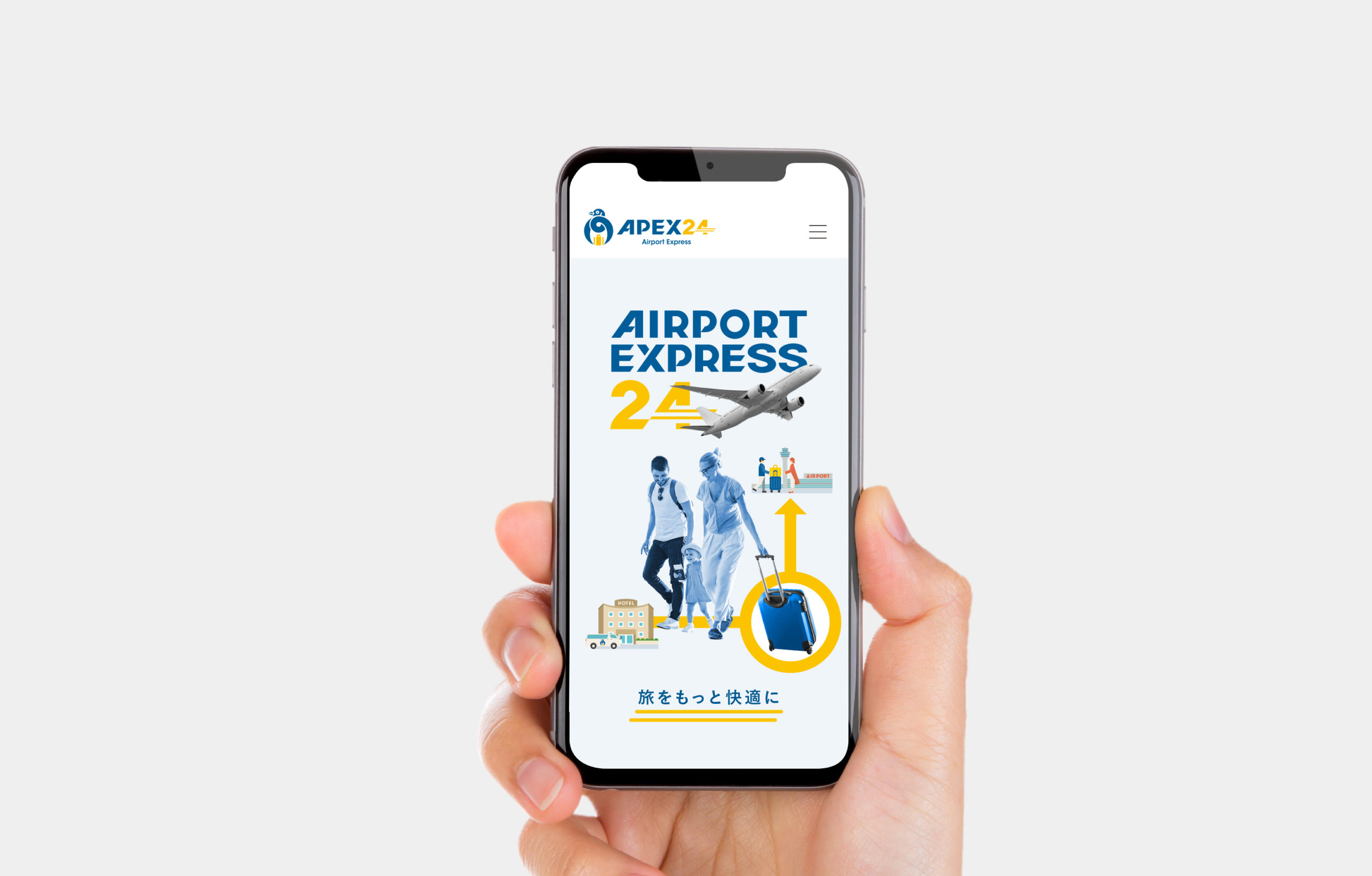
The symbol mark for APEX24, which aims to provide prompt and courteous baggage delivery services mainly to foreign tourists visiting Japan, was designed to represent the “A” in the name, based on a family crest with a distinctly Japanese flavor. The family crest “Musubikarigane-mon” (the family crest of the Japanese family) is a “goose” meaning “bird that brings happiness,” and thus represents the A-rank delivery service that carries customers’ precious baggage and good fortune. The main color blue represents the color of the sky, which is highly compatible with the airport, and the yellow color at the important “baggage” and “24” points signifies the happiness of the tourist’s journey and the speed of our prompt service.
主に日本に訪れる外国人観光客に向けて、迅速丁寧な手荷物配送サービスを目指す「APEX24」のシンボルマークは、日本らしさを感じる家紋をベースに名称の「A」を表すシンボルマークを設計しました。ベースの家紋“結び雁金紋(むすびかりがねもん)”の雁(がん)は「幸せを運ぶ鳥」の意味があることから、お客様の大切な手荷物と幸運を運ぶAランクの配送サービスを表しました。メインカラーのブルーは空港と親和性の高い空の色を表し、大切な「手荷物」と「24」の箇所のイエローは観光客の旅の幸せや迅速なサービスの速さの意味を込めています。

Credit /
Client: L.CRAS
Art direction & Design: Daisuke Kobayashi (SUKEDACHI DESIGN)
204-3-21-4, NOMA, MINAMI-Ku,
FUKUOKA-City, Fukuoka, 815-0041, JAPAN